CISCO DESIGN LANGUAGE PROJECT
Lay the ground work for Cisco’s next generation products
Brand: CISCO
Development: 2013
“Defining the Next Evolution of Cisco’s Industrial Design Language”
In 2011 I joined Cisco Systems’ Central Engineering team to take a holistic view of the product portfolio. Years of acquisitions had created a diverse but fragmented design landscape. My role was to bring this together and establish a clear industrial design identity for the Security Technology Business Unit (STBU) and the Unified Access Business Unit (UABU). The aim was to explore a design language that could span multiple product lines, speak with one brand voice, and set a direction for the future.
SHAPING THE NEXT CHAPTER
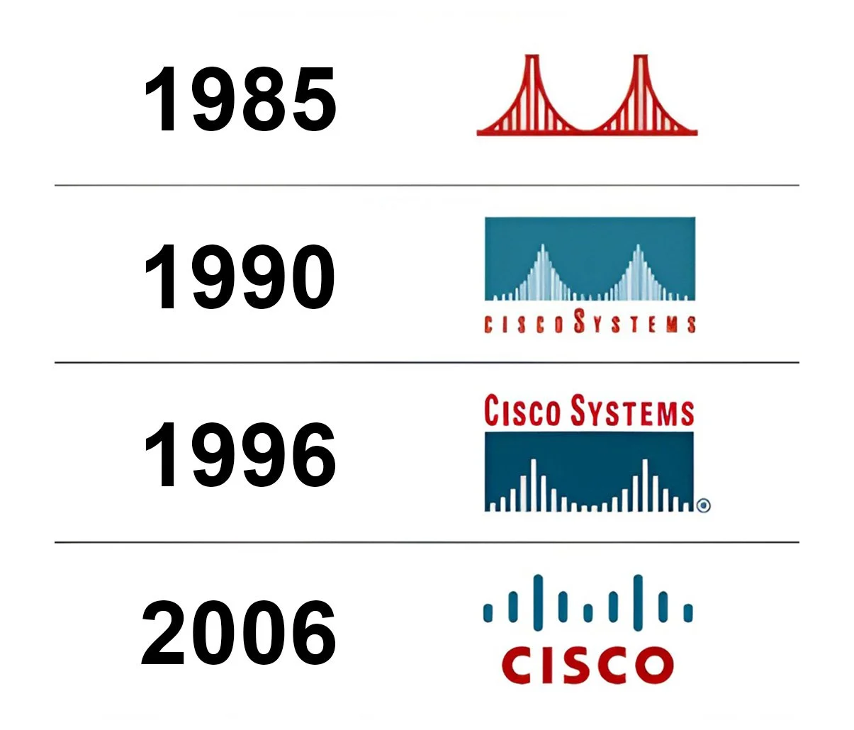
BRAND EVOLUTION
Understand the corporate brand direction shift through out the past and think about how might we evolve our products from here.

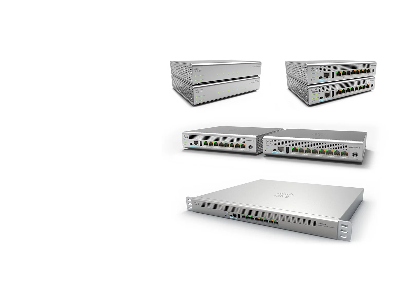
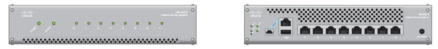
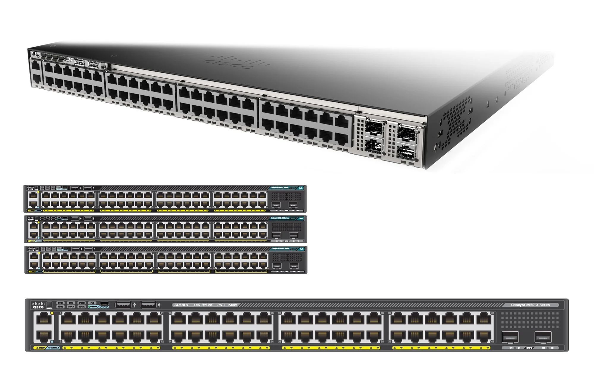
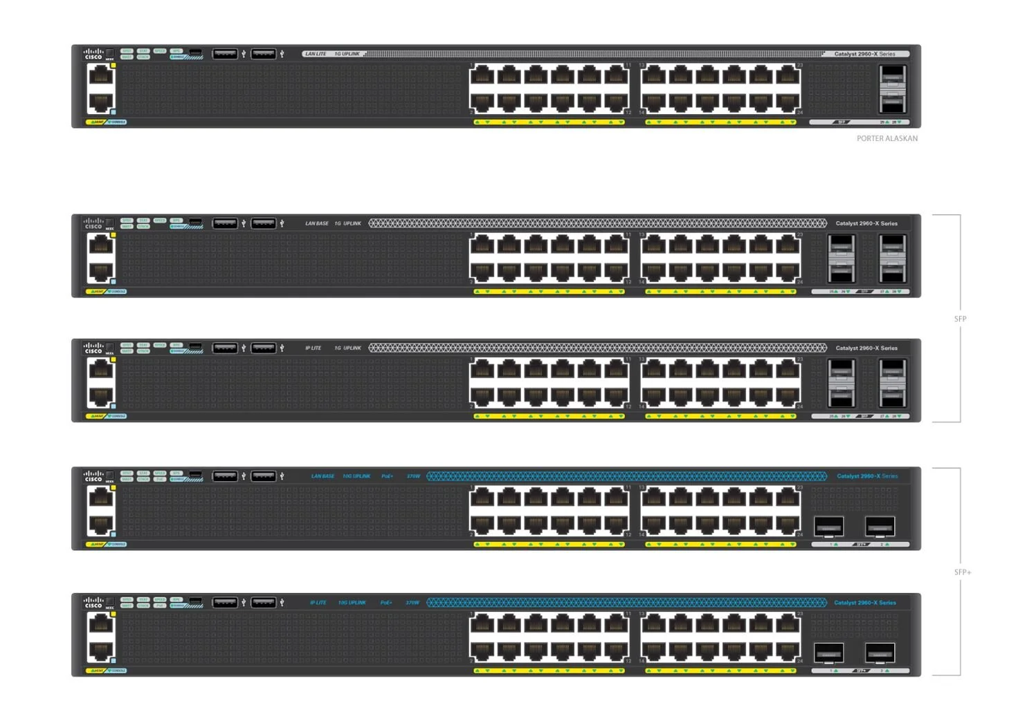
LEGACY PRODUCTS
Where we started and how we have been utilizing the teal color as a part of brand identity. How we might update bezels & plastic-heavy forms.
DESIGN PRINCIPLES
Where we needed to go & how to translate that into tangible design choices.
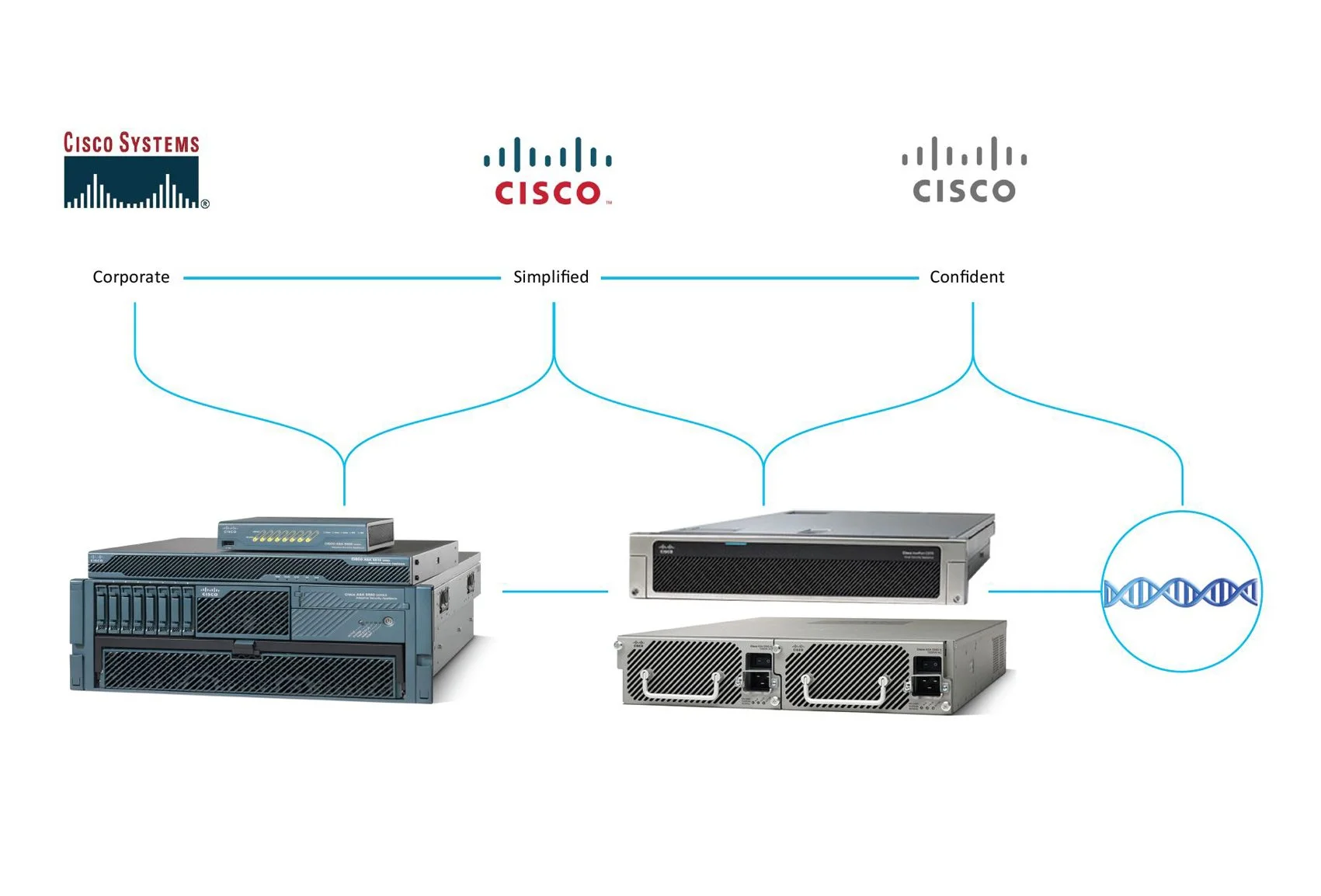
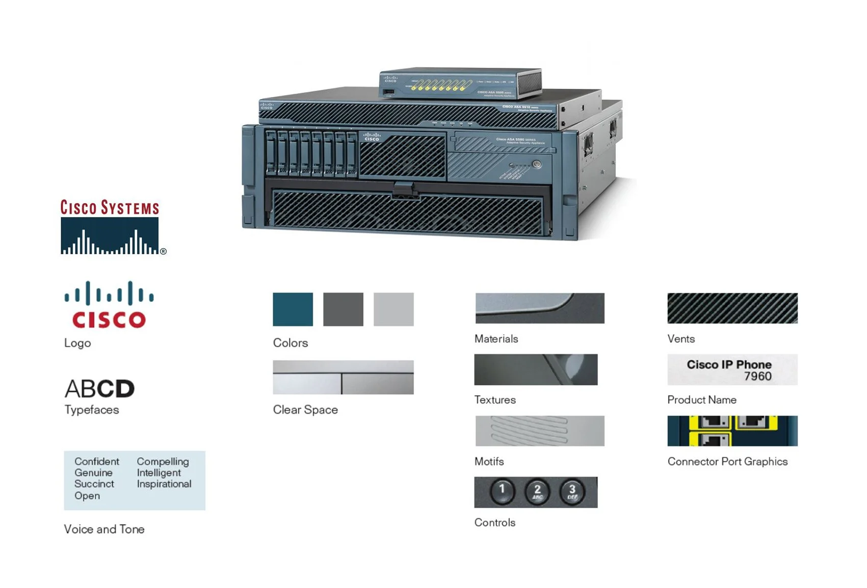
EVOLUTION — IDENTIFYING CISCO’S DNA
This study explores how Cisco’s design identity could evolve. I introduced new colors, details, and design elements to refresh the look and feel of the products.
Each page highlights key components — color palettes, surface treatments, and signature details — that strengthen usability, security, and brand recognition.
The goal is to move beyond individual product styling and create a consistent design system. A modern industrial aesthetic, approachable yet distinctly Cisco.
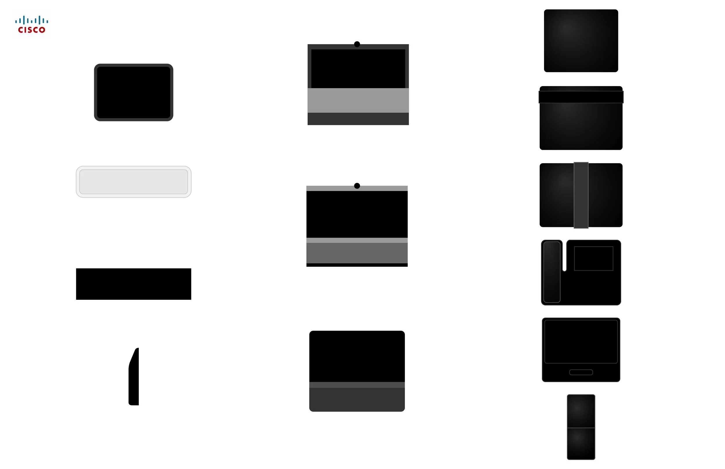
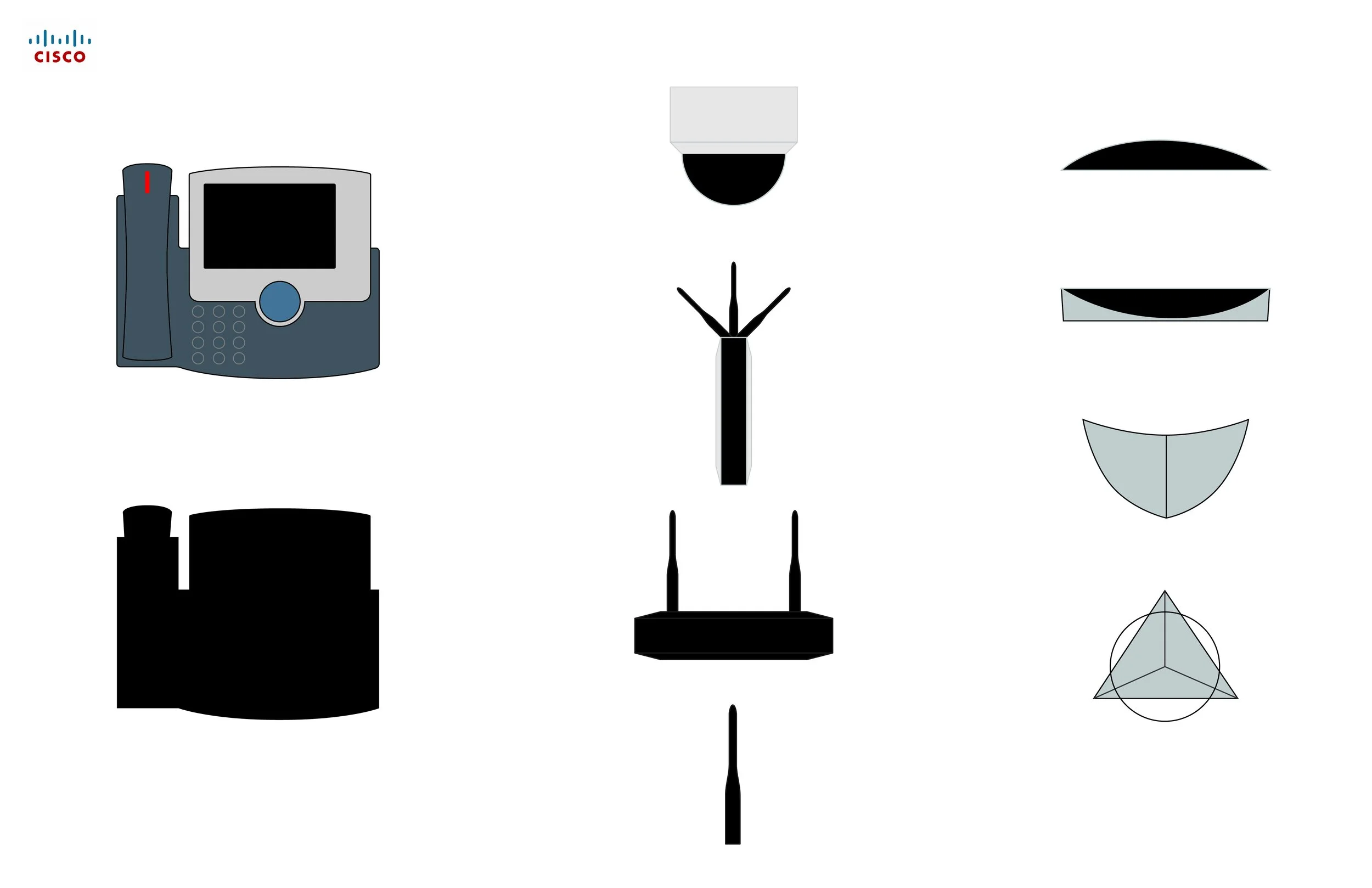
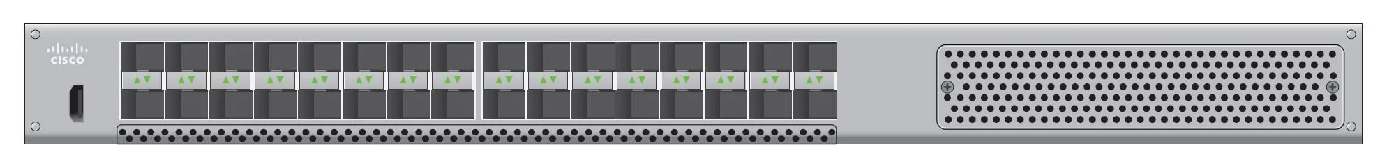
MAPPING WHAT FEELS ICONIC
This study looks at what connects Cisco’s wide range of products. Representative models were reduced to clean silhouettes, with key details highlighted through simple icons.
Patterns began to emerge in the placement of ports, vents, and light indicators, showing how these choices give each unit its own personality. By stripping things back to the essentials, it became easier to see the elements that feel truly iconic across the brand.
Collaboration with Tanberg (Norway)
Office Phones
Large Monitors
Monitor Stands
Telepresence
WebEx
Enterprise Networking
IoT

Security Technology
Enterprise Networking
Data Center
Service Provider
Service Technology software
Security
IP Phones (Original Cisco Models)
Video Surveillance
Enterprise Networking
Routers
switches
wireless LAN controllers
branch networking
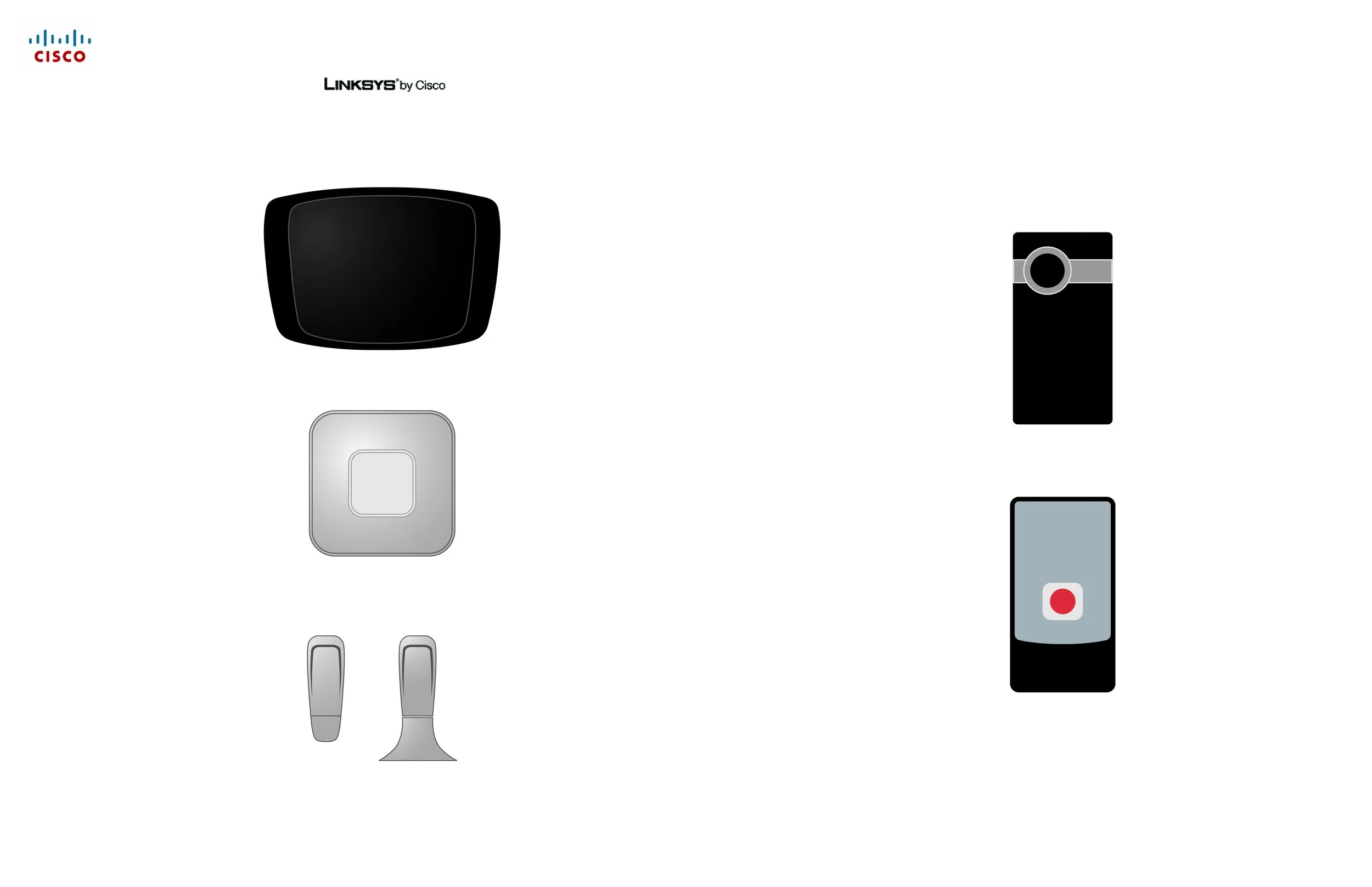
Consumer Products
(By Aquisitions)
Flip Video cameras
Linksys home routers
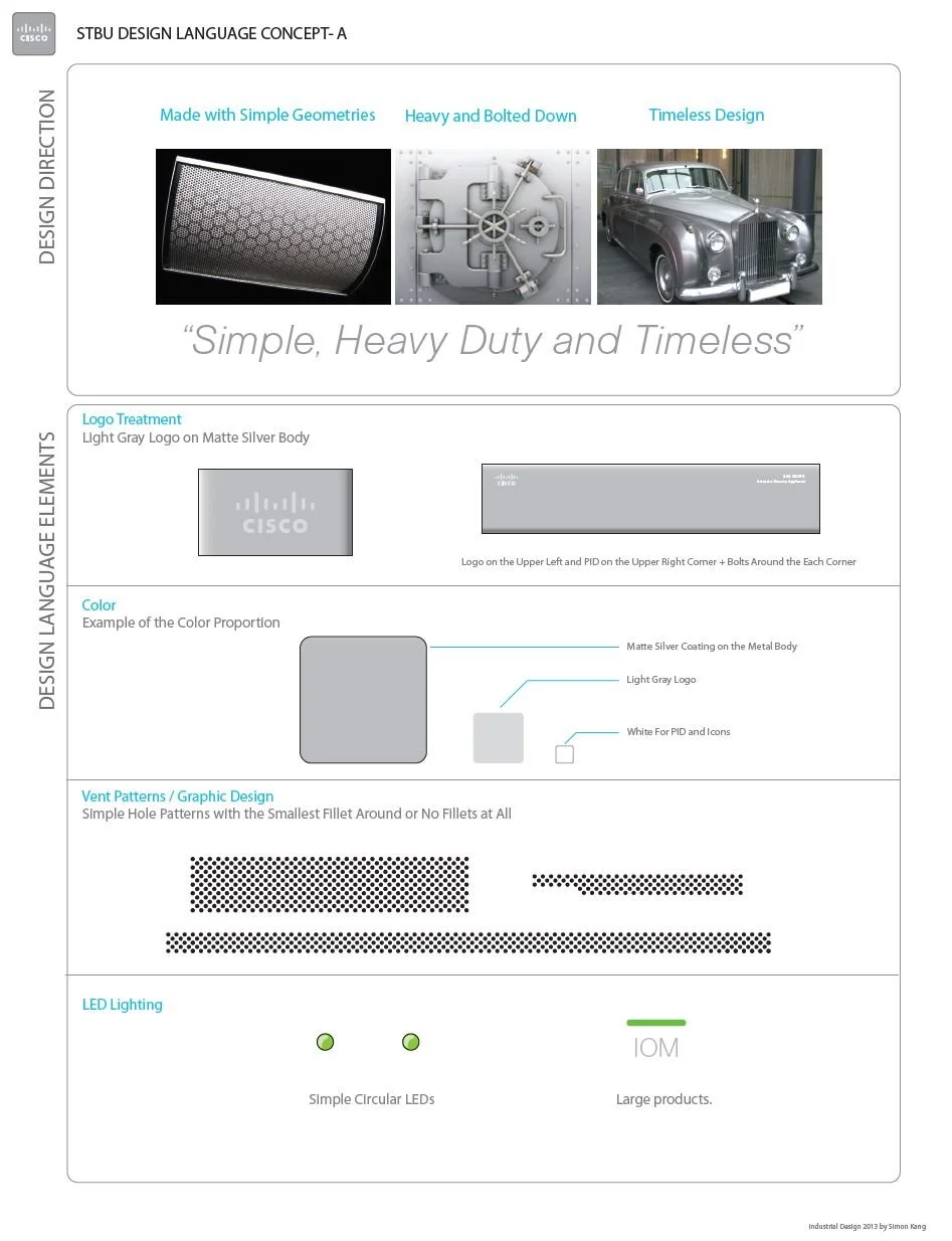
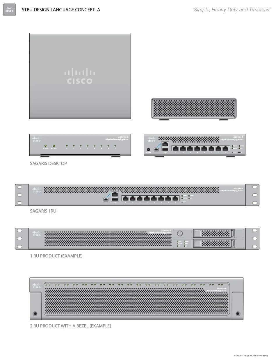
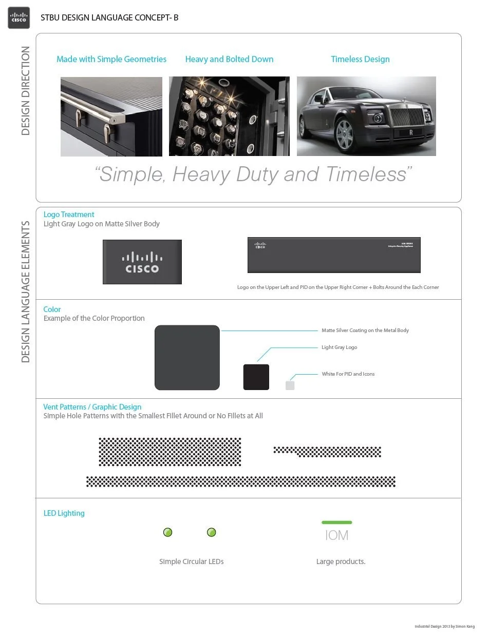
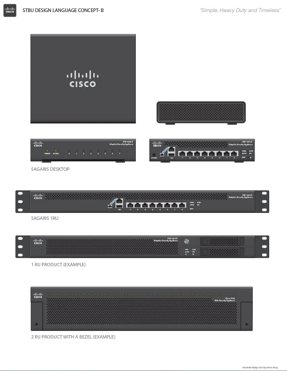
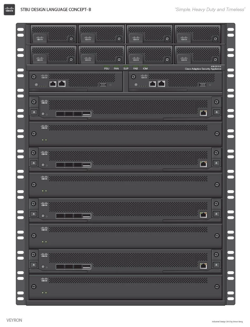
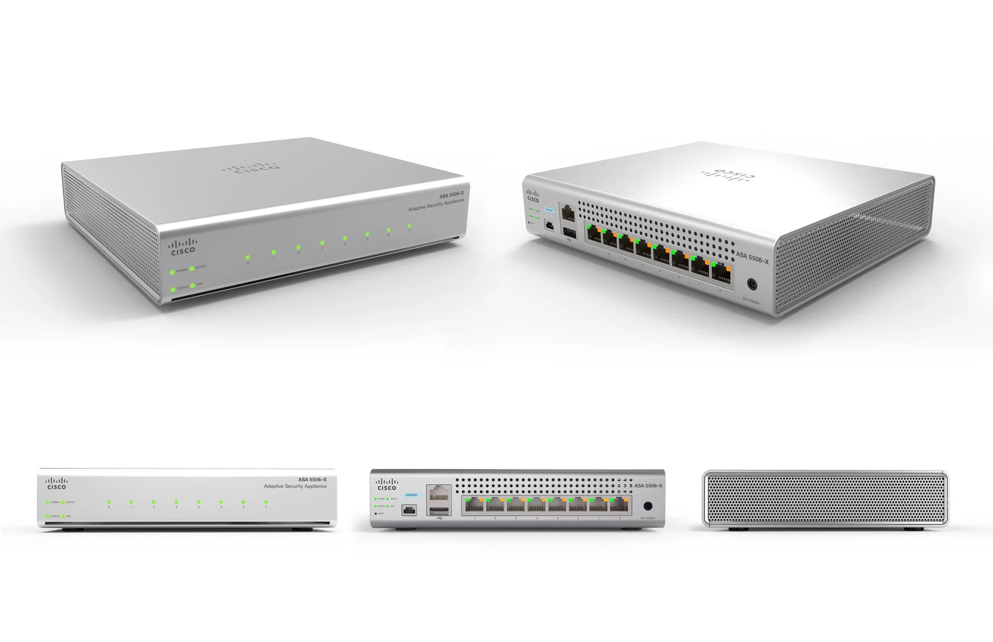
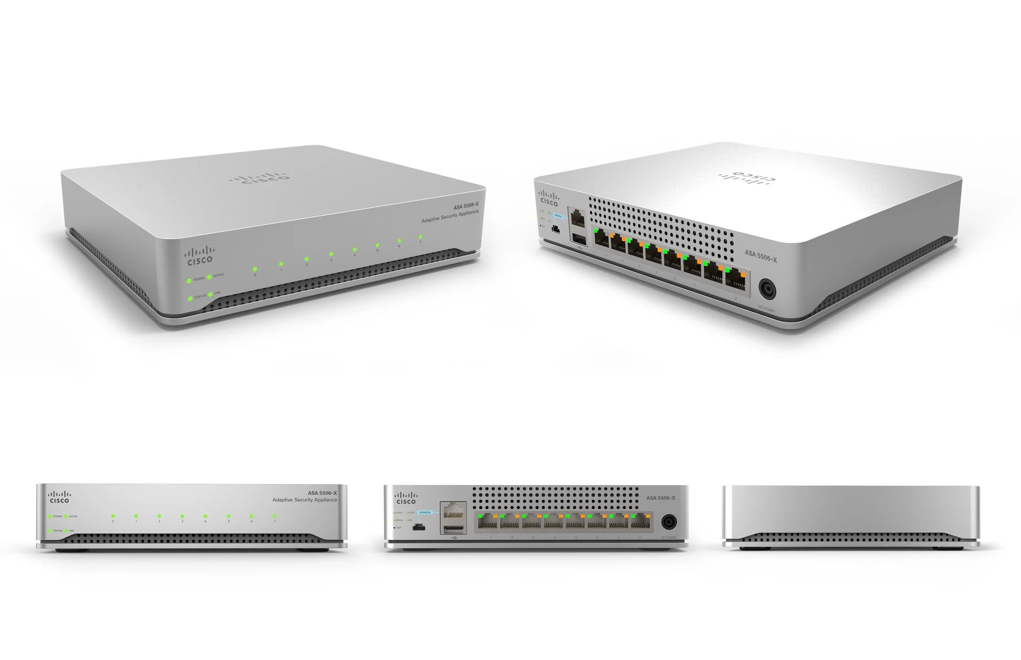
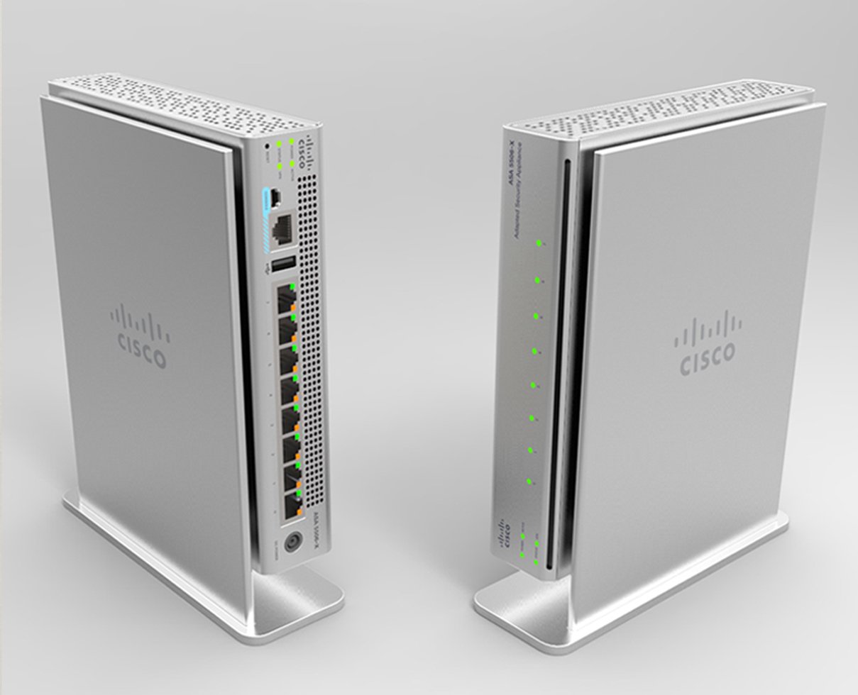
CISCO CONCEPTUAL DESIGN LANGUAGE PROPOSAL
The proposal reimagines Cisco’s design identity through new colors, refined details, and distinctive elements. The aim is to elevate the visual and tactile qualities of the products while creating a stronger, more unified story that reflects values of security, reliability, and innovation.
Each page highlights a specific design component — from color palettes that shift perception, to surface treatments that add precision, to detail cues that strengthen usability and trust. These explorations serve as a conceptual study, helping internal stakeholders envision how future products could express a clearer and more flexible brand identity across business units.
The direction moves beyond individual styling toward a holistic design system. By capturing what feels iconic today and building on it, the study outlines a path toward a modern industrial aesthetic that is approachable yet distinctly Cisco.
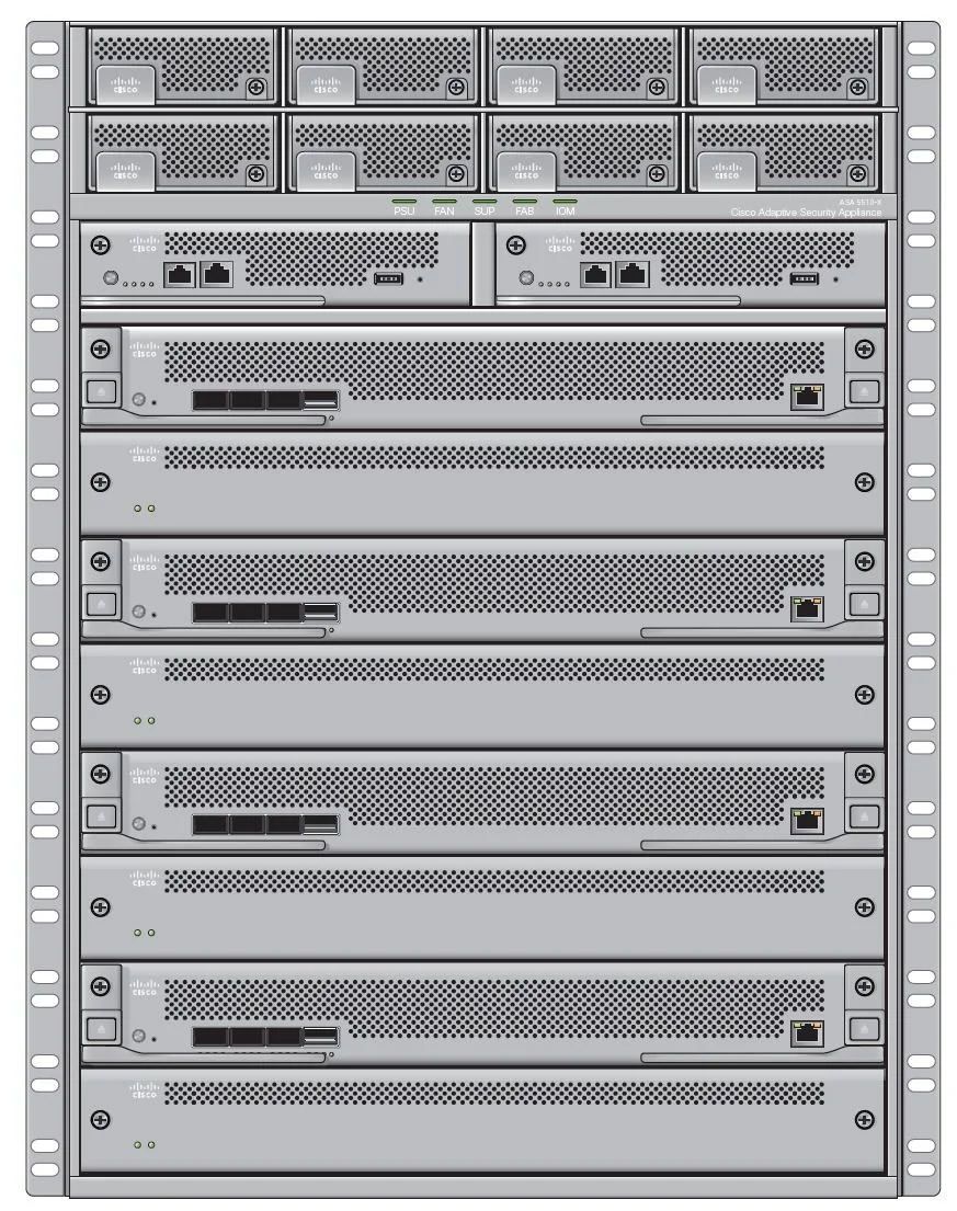


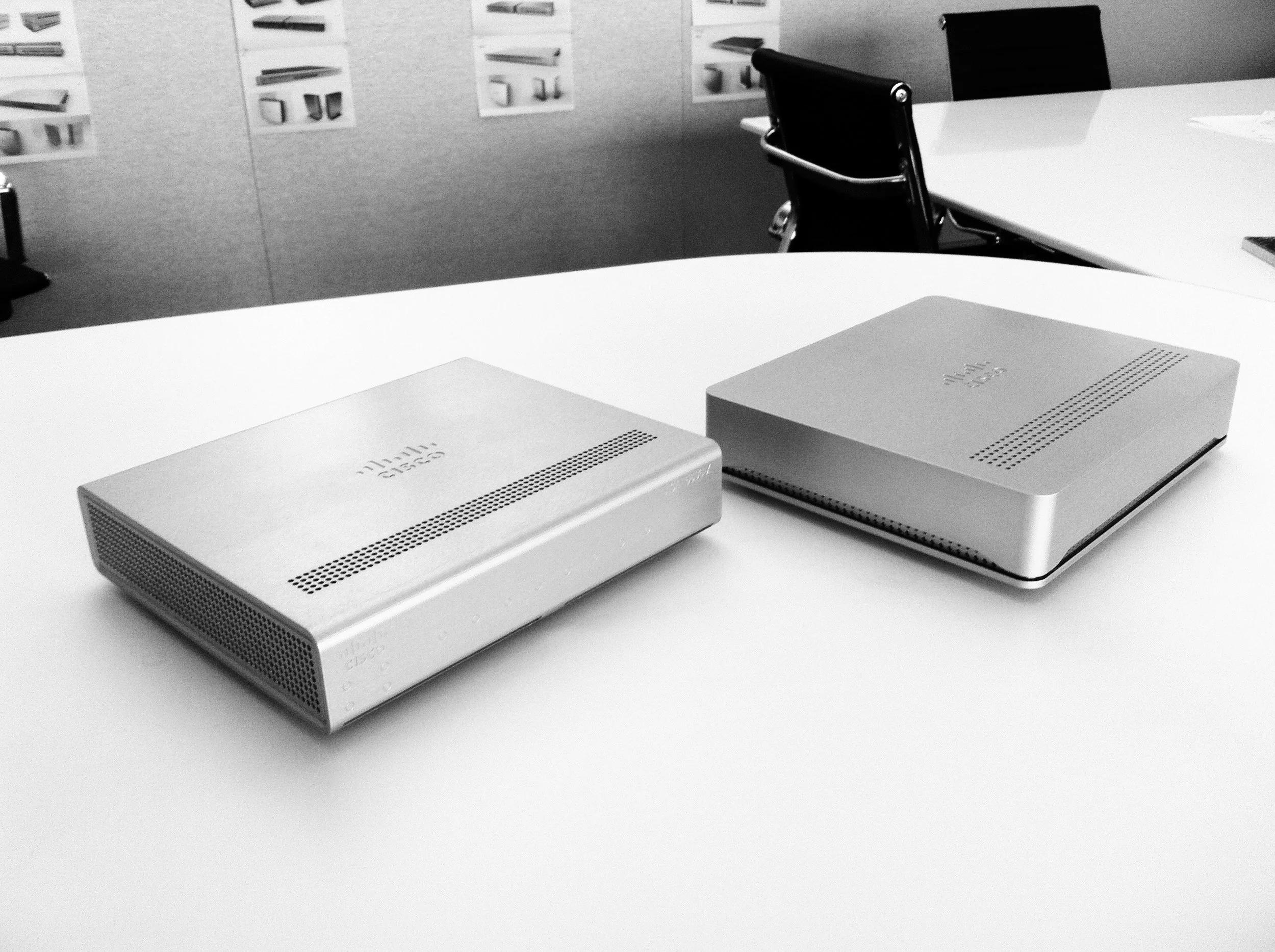
CNC MILLED PROTOTYPES
At the end of the project the Central Engineering team built a set of physical prototypes using CNC-milled metal blocks. These archetypes represented a new vision for Cisco’s Network Security and Firewall appliances, translating the design language into tangible forms that communicated strength, precision, and a modern industrial character.
What began as an exploration of Cisco’s design identity became an important step toward defining the future of Cisco’s product design language.
By examining the fundamental DNA of Cisco hardware — color, form, materials, and signature details — this study introduced a refreshed visual system that balances technological sophistication with approachability. The proposed design elements strengthen usability, reinforce perceptions of security and reliability, and create clearer brand recognition across product families.
The work moves beyond styling individual devices. It establishes the foundation for a scalable industrial design framework that allows Cisco’s product ecosystem to evolve with consistency, clarity, and confidence.