SAMSUNG DESIGN LANGUAGE PROJECT
Envisioning next generation of Samsung mobile phones
Brand: SAMSUNG
Development: 2007
Global design vision for the future of Samsung Mobile
In 2007, the new CEO tasked select global Advanced Design Teams to define Samsung’s future design language.
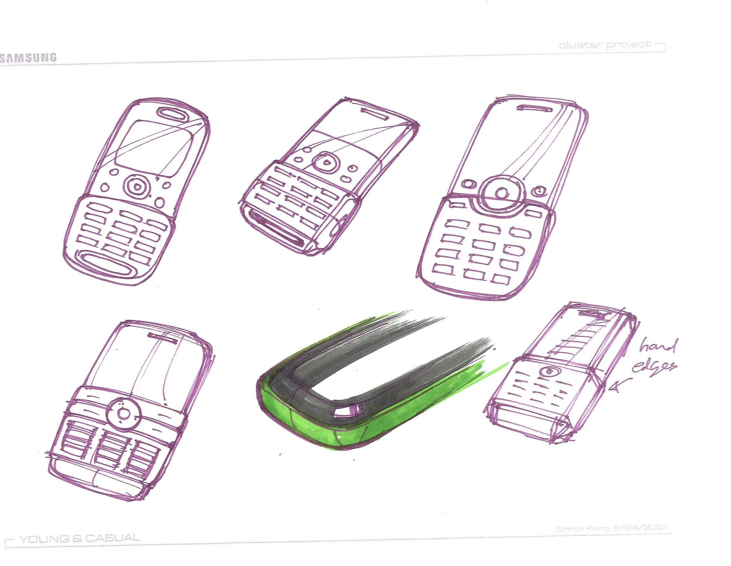
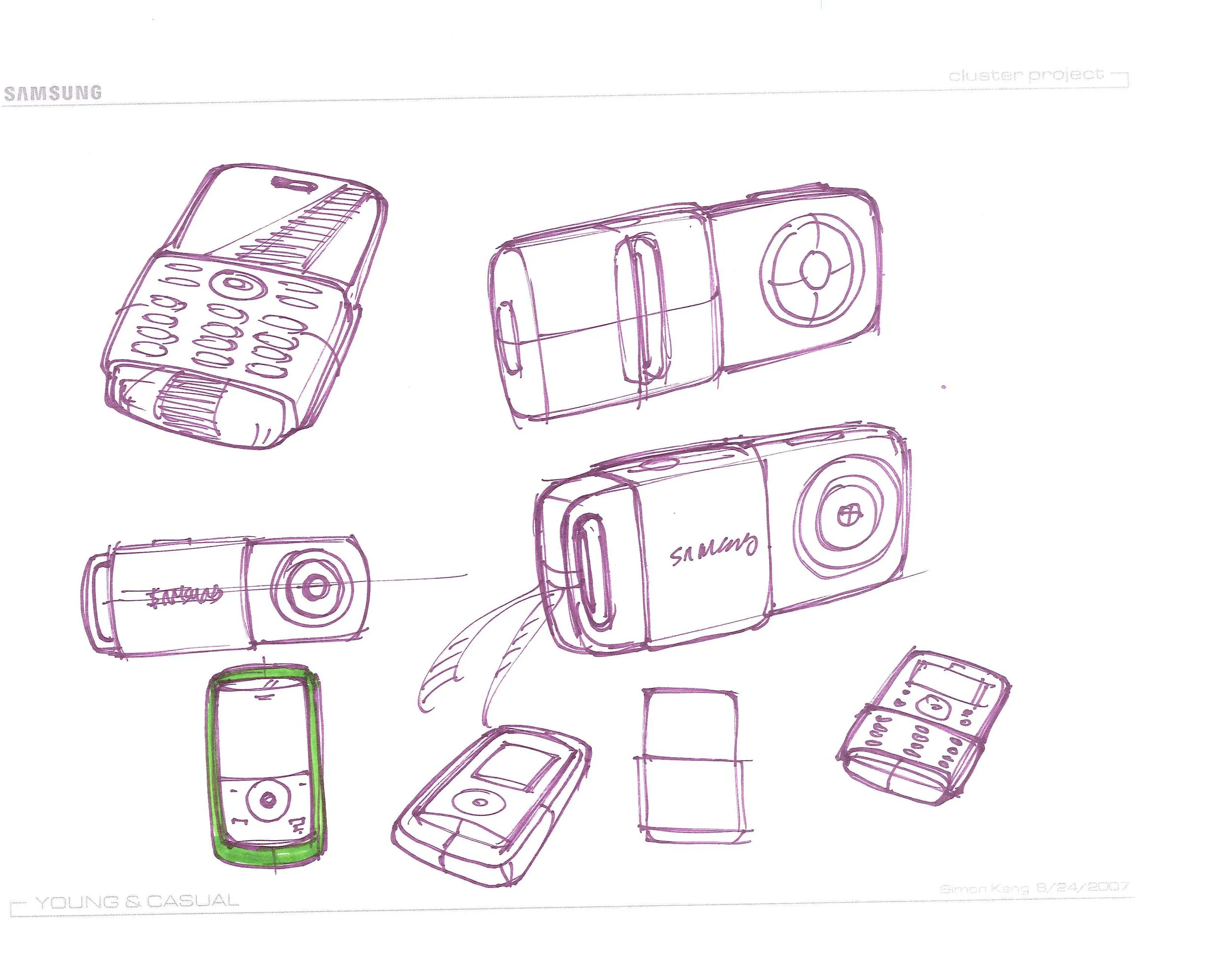
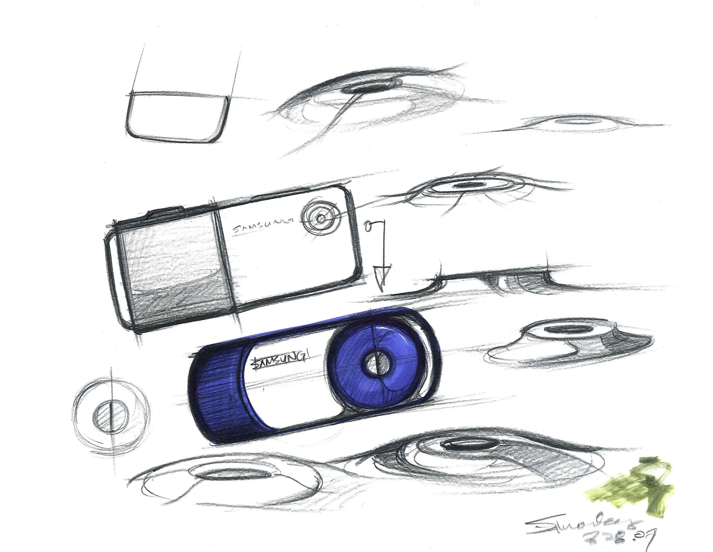
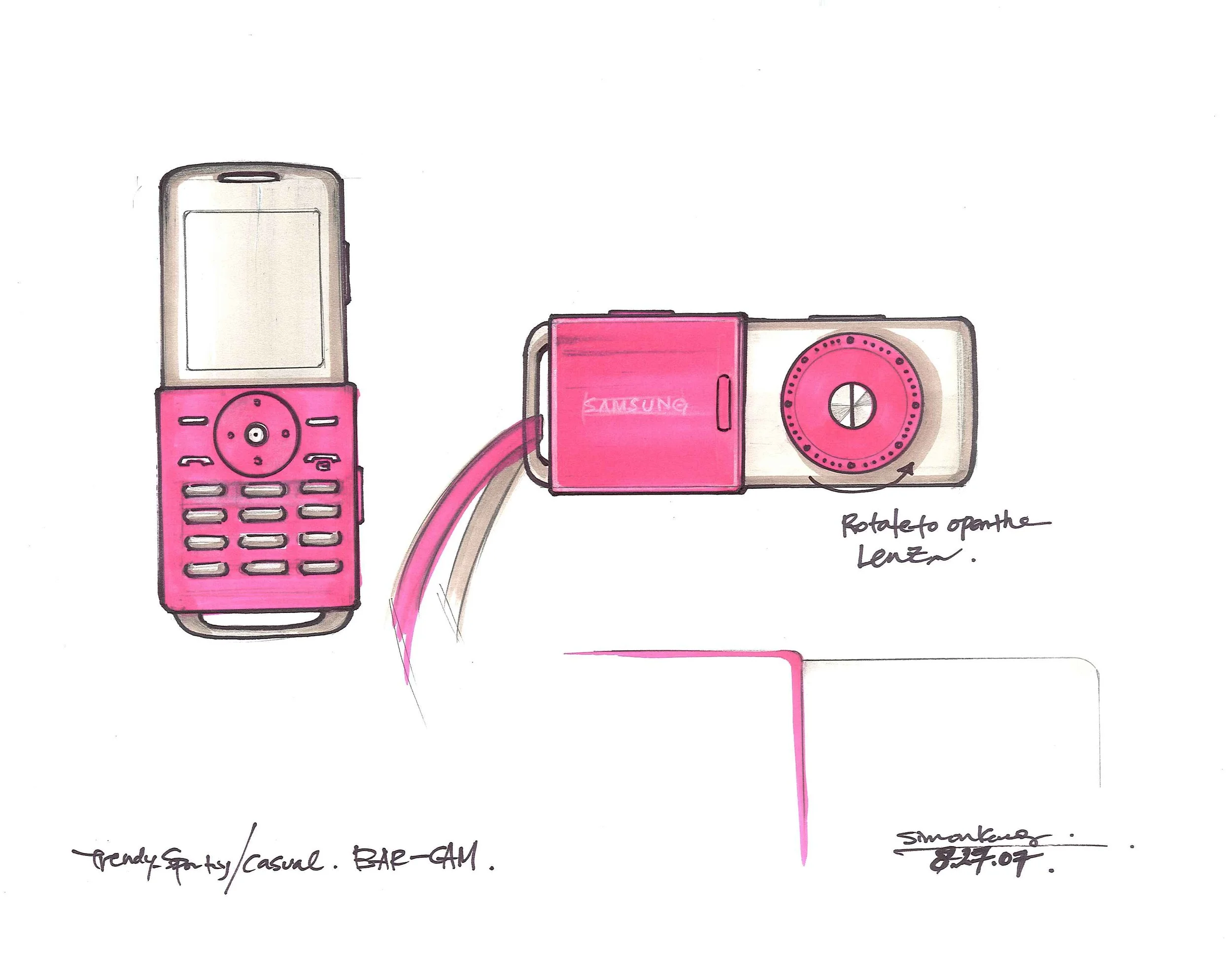
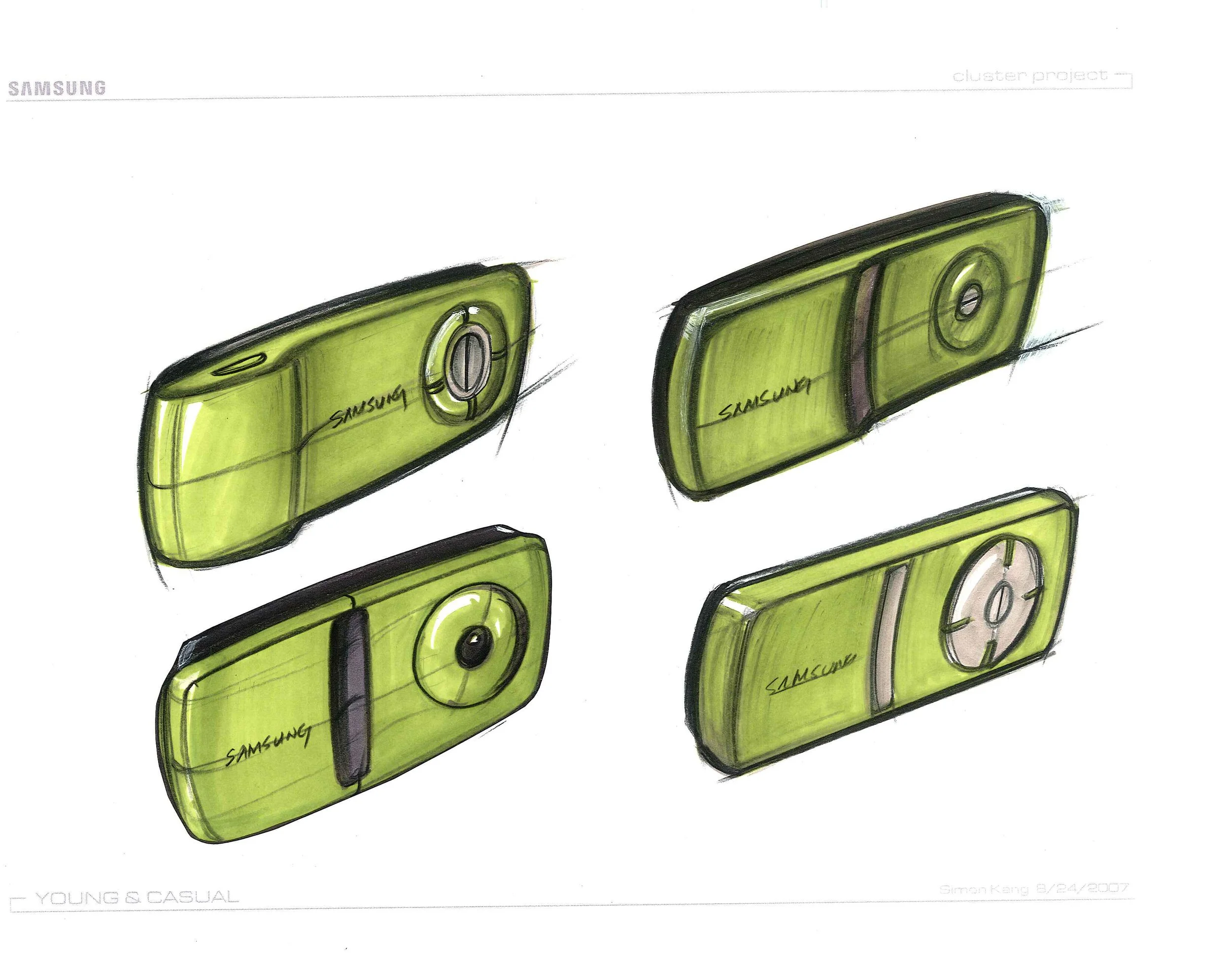
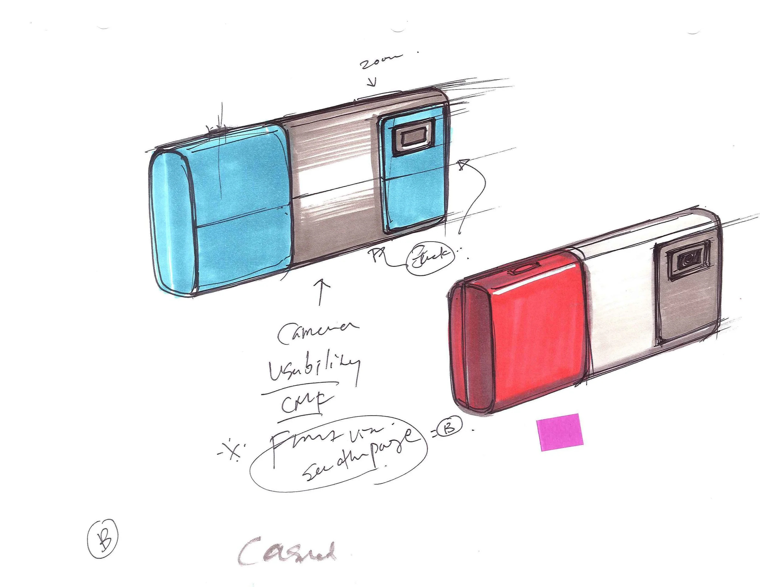
I focused on the Sporty Casual segment, envisioning simple forms with bold CMF integration and proposing new innovations for evolving mobile behaviors.

BRIEF
SPORTY CASUAL
Envision the Sporty Casual user group, asking who they are and what they care about. Explore the designs that bring personalities.
FUTURE OF TEXTING
Envision the future of texting in mobile phones. How might emerging technologies reshape behaviors, and what innovations could enhance the experience for text-heavy users?

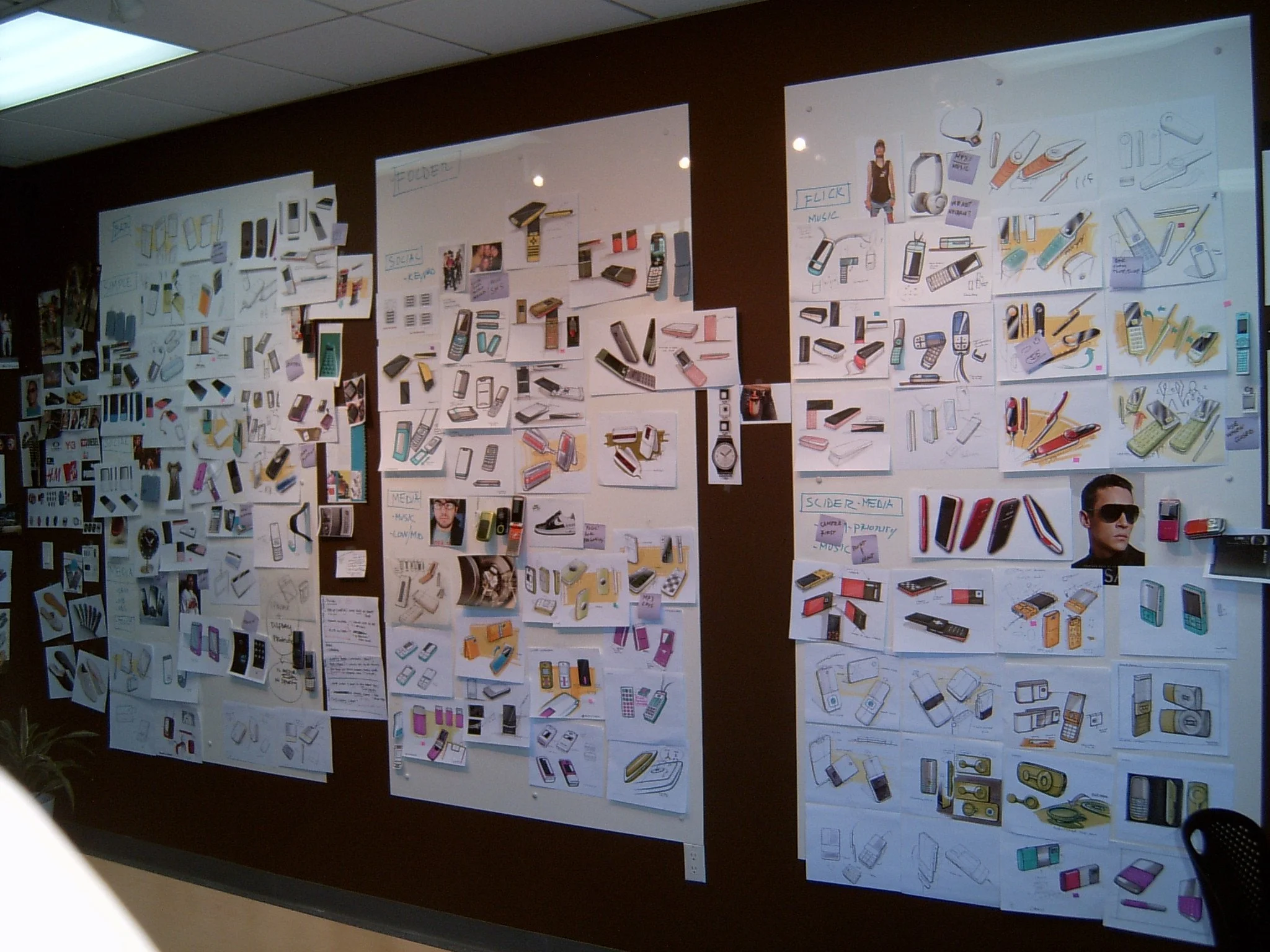
DESIGN MOCKUPS
Create and present mockups served as future archetypes, demonstrating new directions for Samsung’s design language.
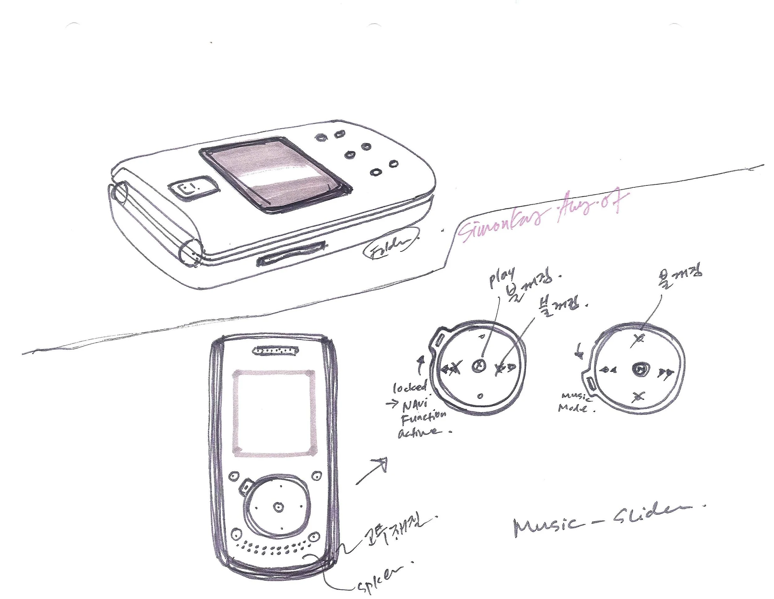
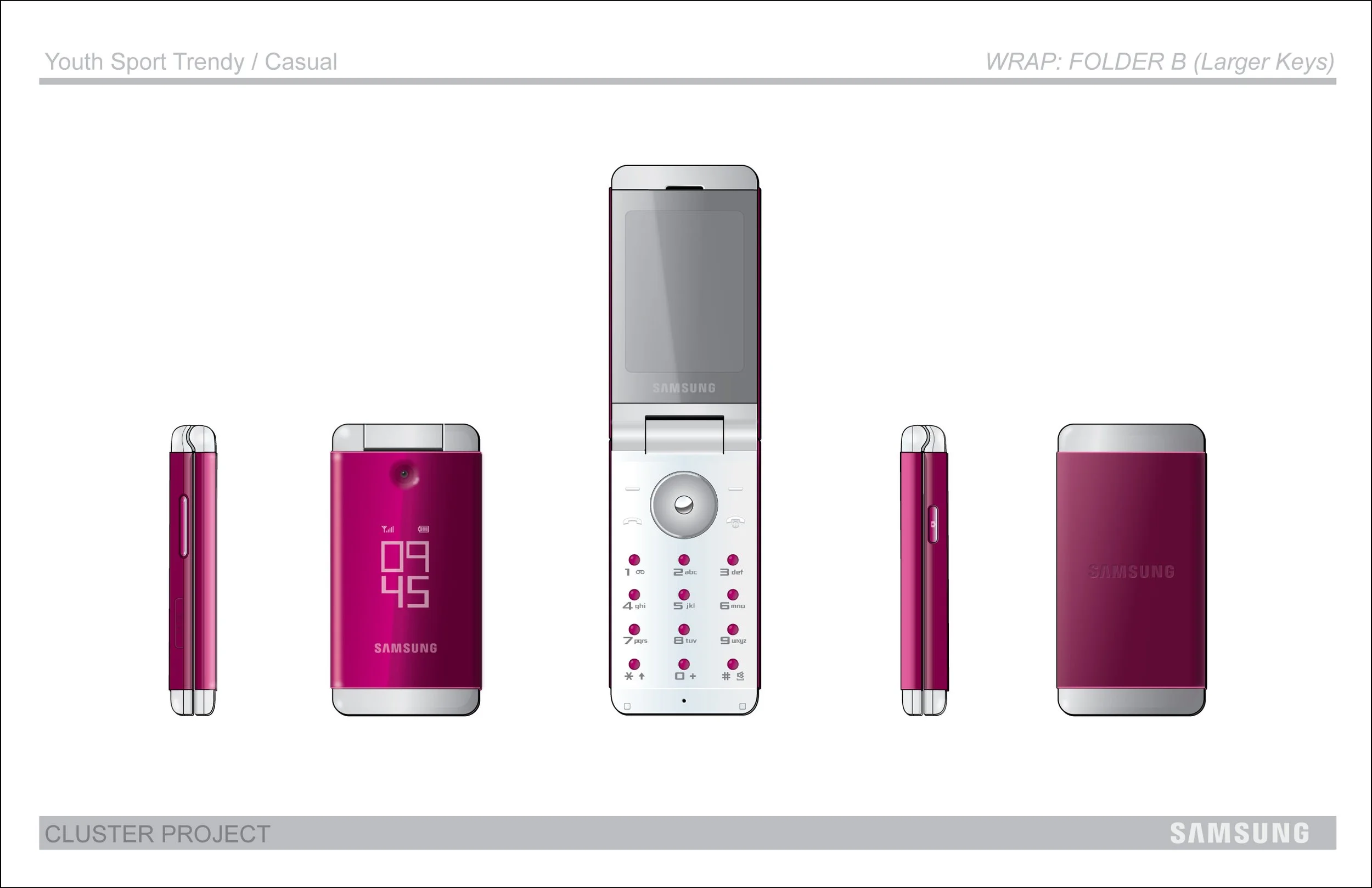
PROJECT 1: IDEATION FOR THE FOLDER PHONE
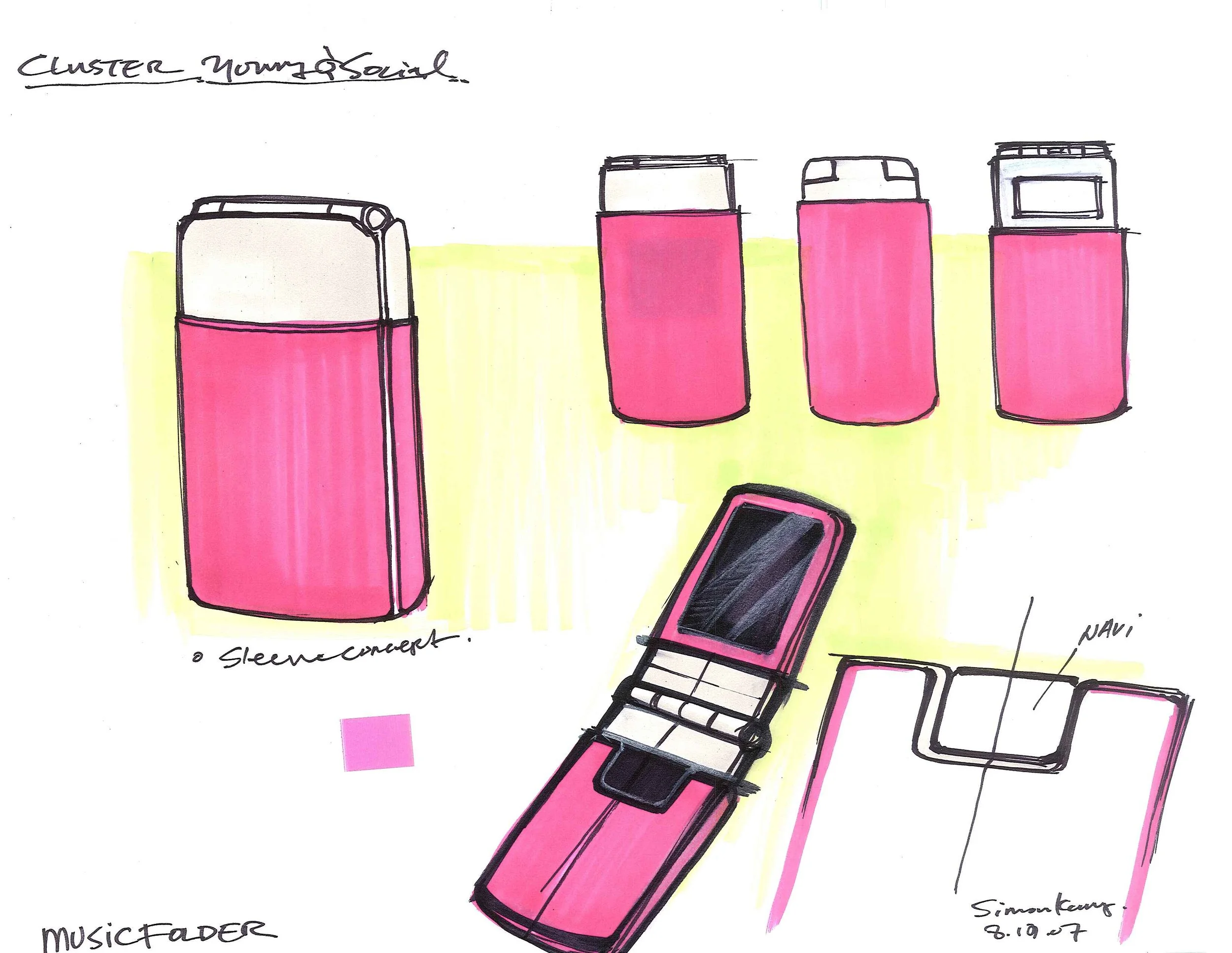
The project began with sketching as a tool of exploration and personal expression. By taking creative liberty, the sketches captured not only the functional aspects of a future Samsung mobile device, but also the emotional qualities that could define its next design language.
Inspired by modern masters like Donald Judd, Joan Miró, and Picasso’s Cubism, I drew from their bold use of form, color, and abstraction. Color blocks, playful markings, and minimalist clarity informed my sketches, appearing simple at first glance yet layered with depth drawn from art history.
To me, storytelling and the “why” behind design choices are essential. Knowing that the Lee family, who lead Samsung, are passionate art collectors with a renowned museum in Korea, I wanted to create a bridge between their deep interest in the arts and the company’s vision for technology. This project explored how Samsung’s future products could cross those boundaries, connecting design, culture, and artistic expression.

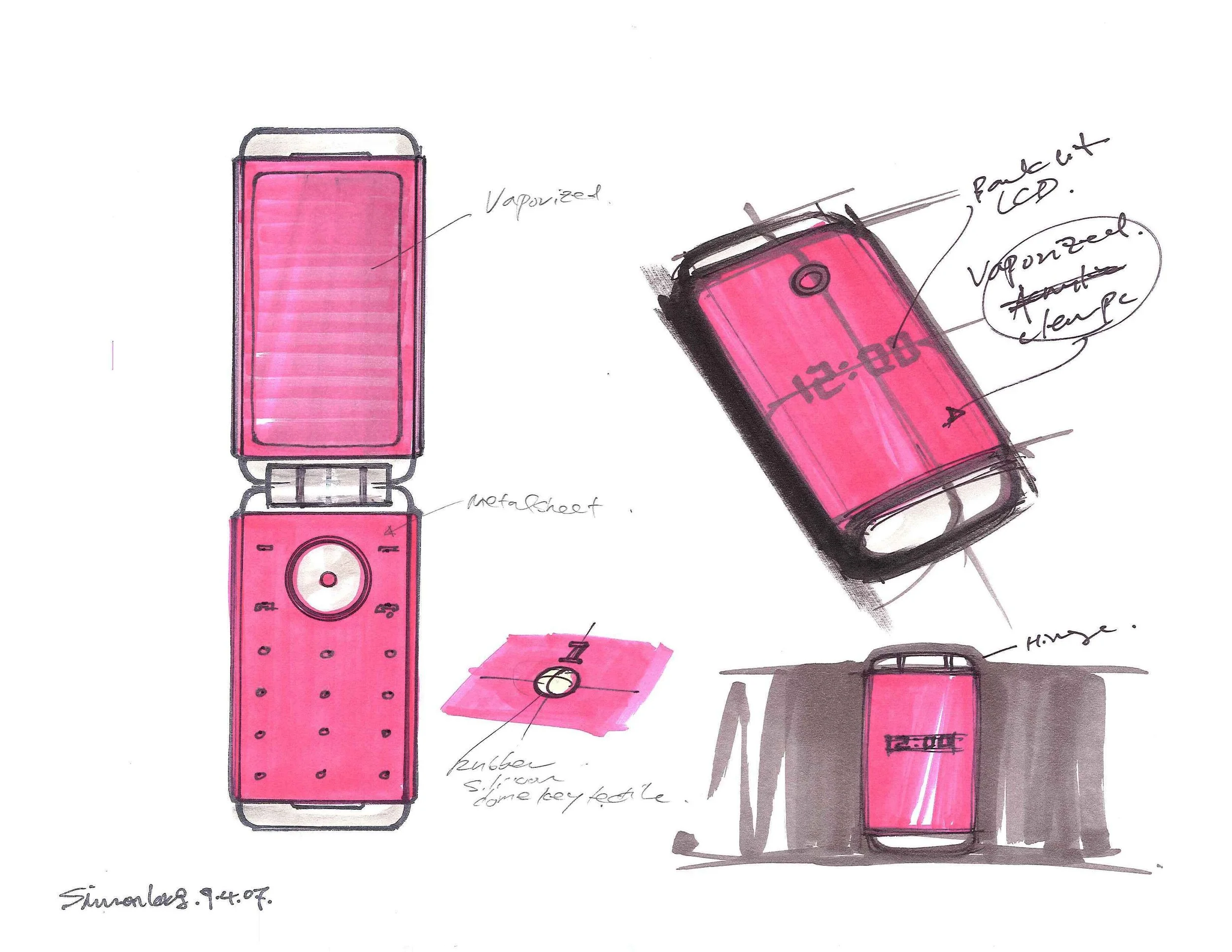
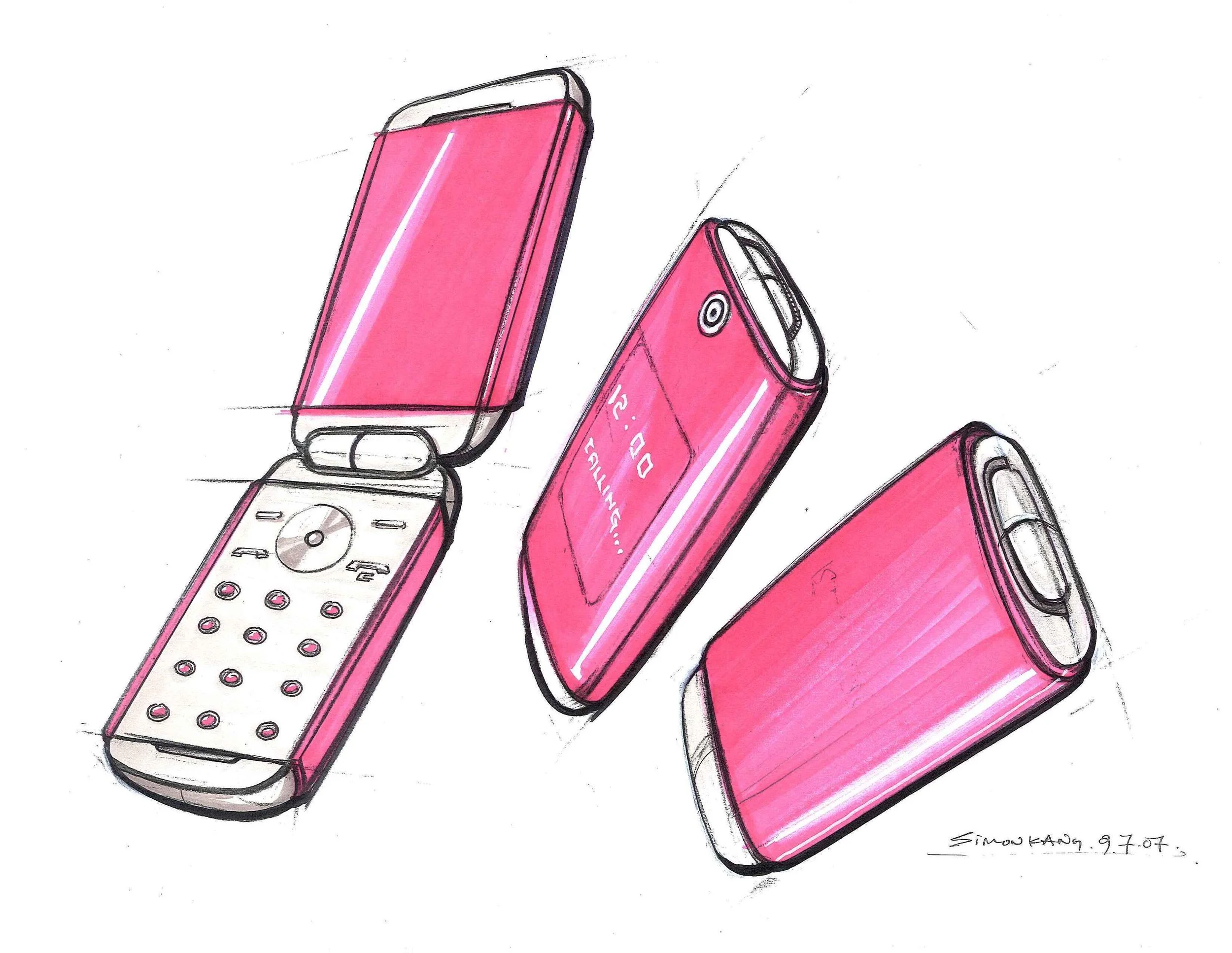

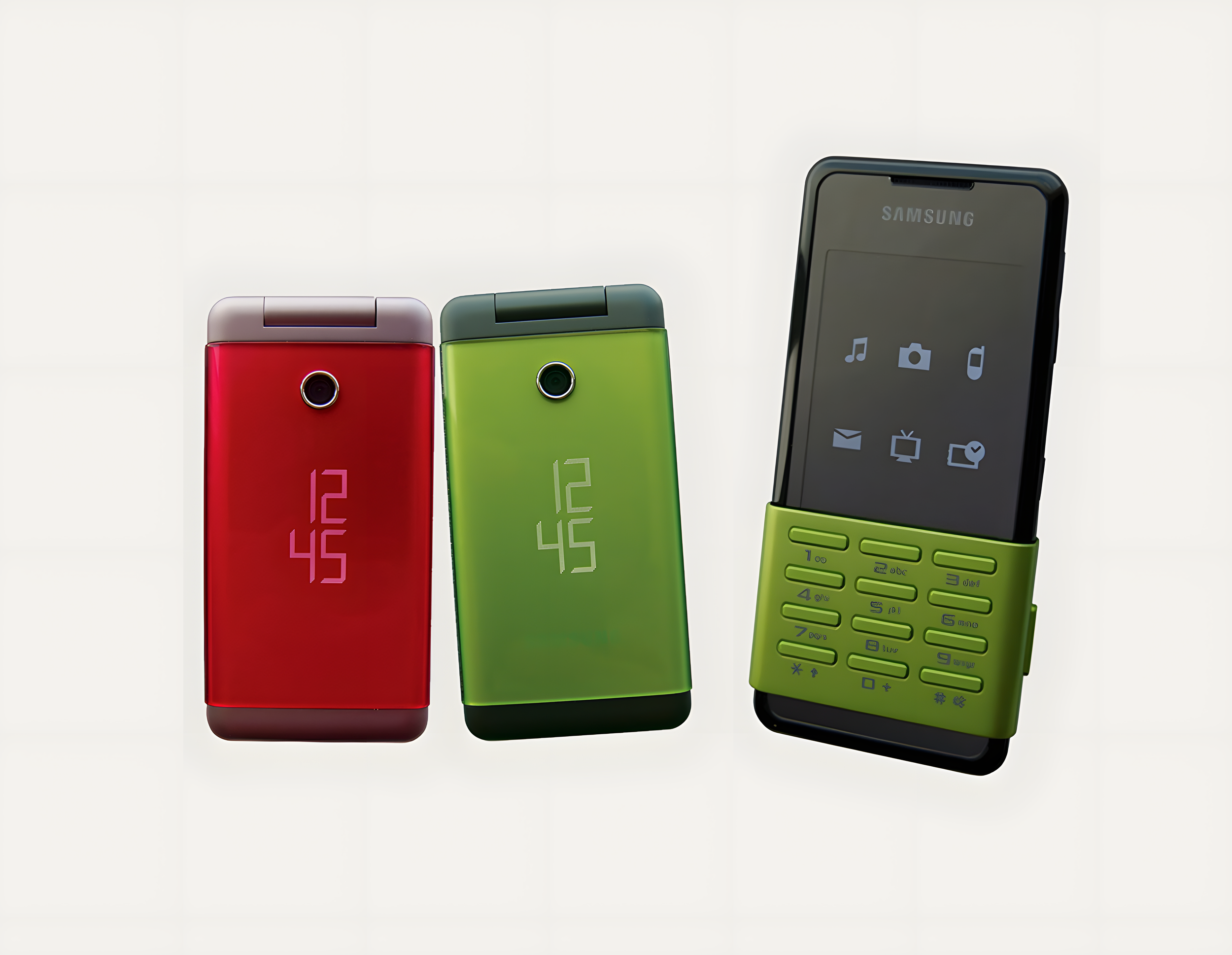
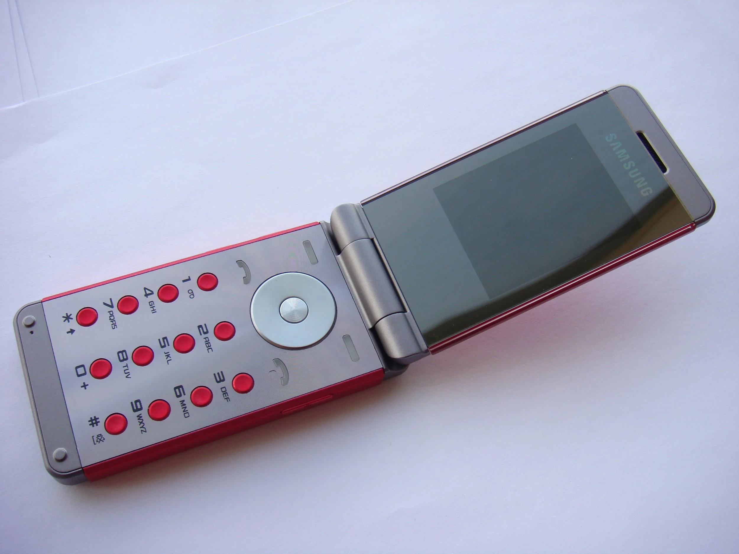
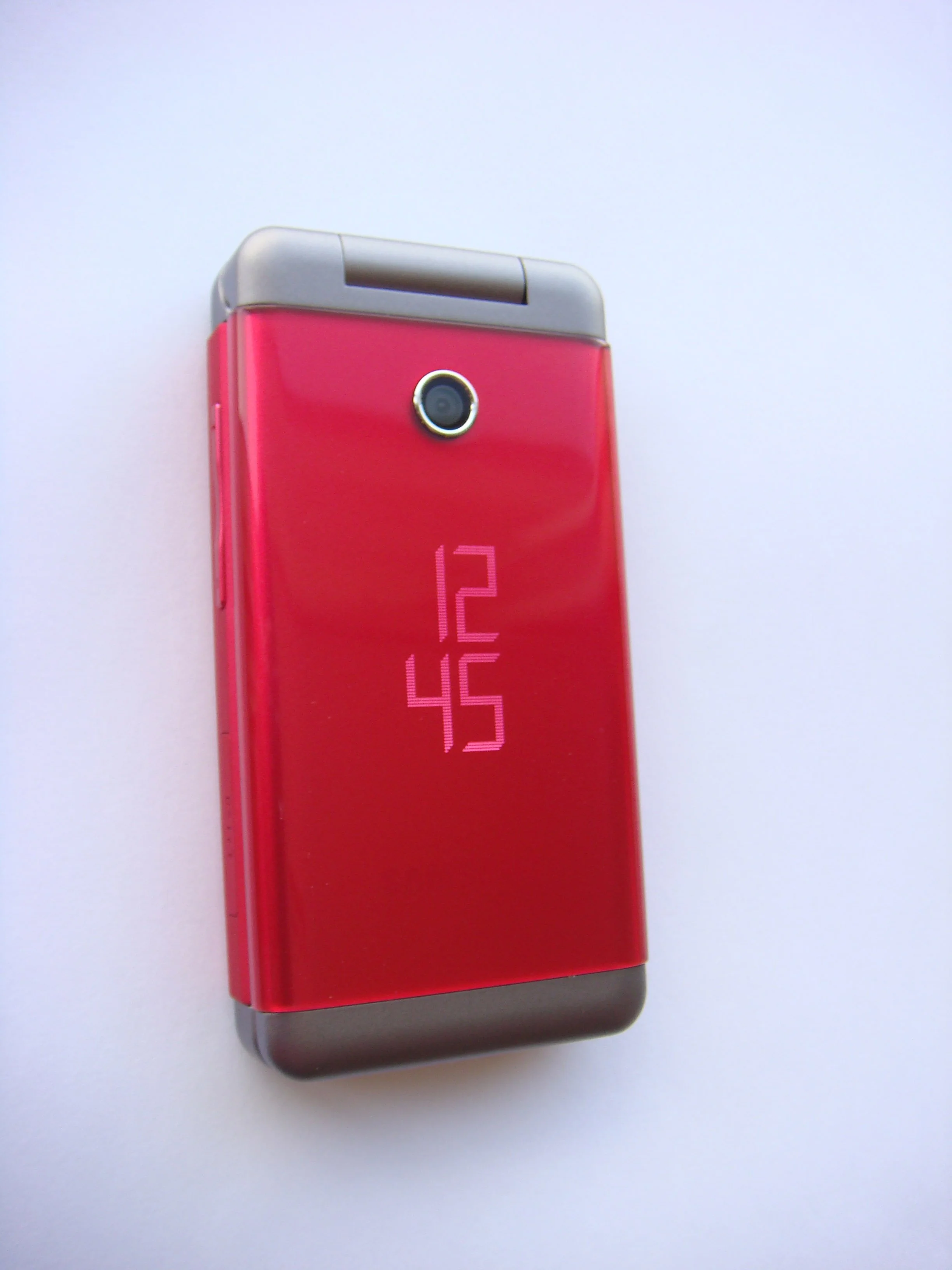
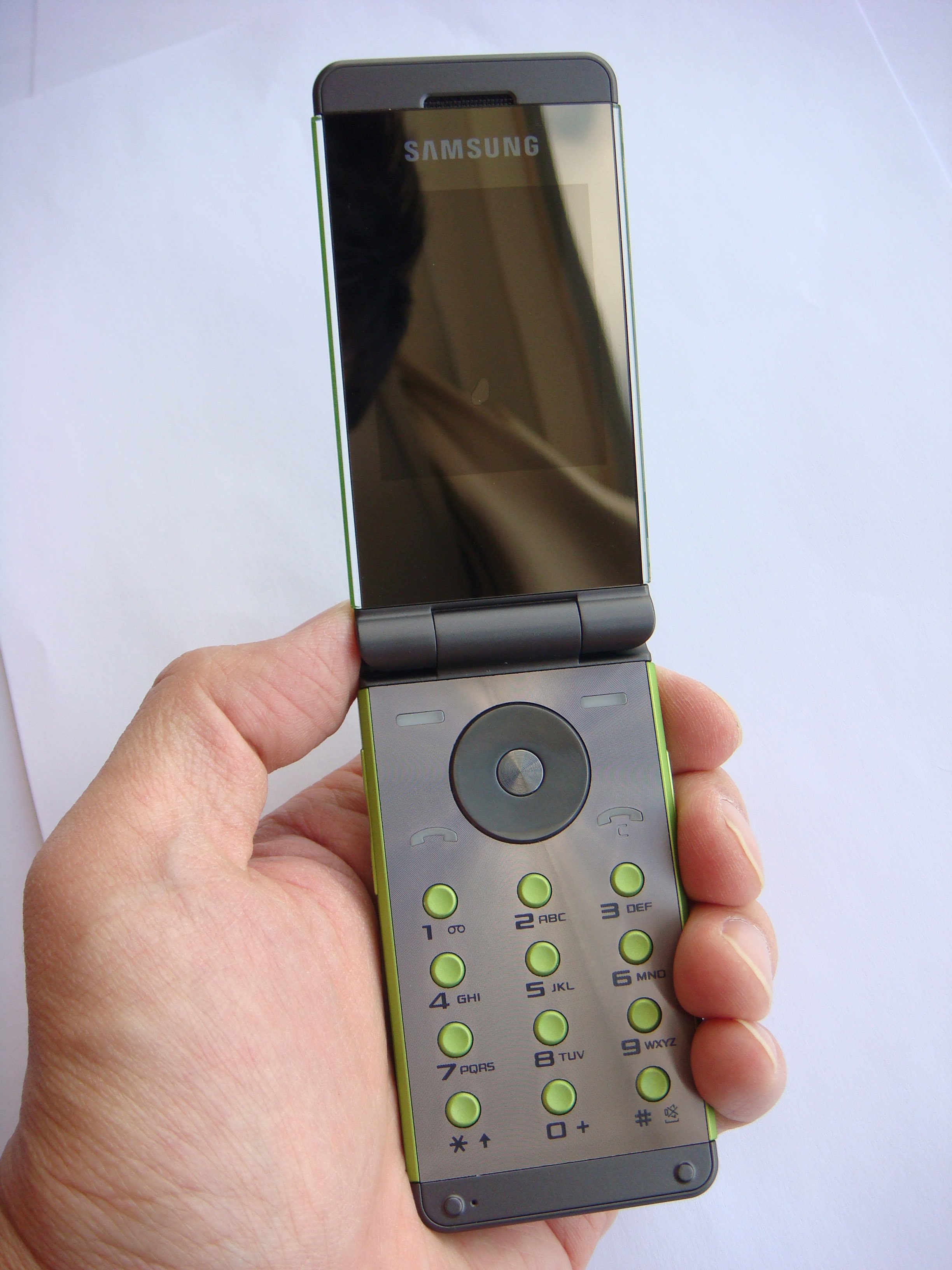
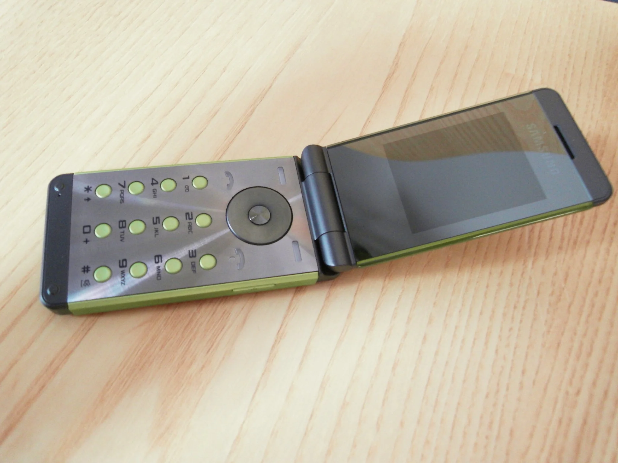
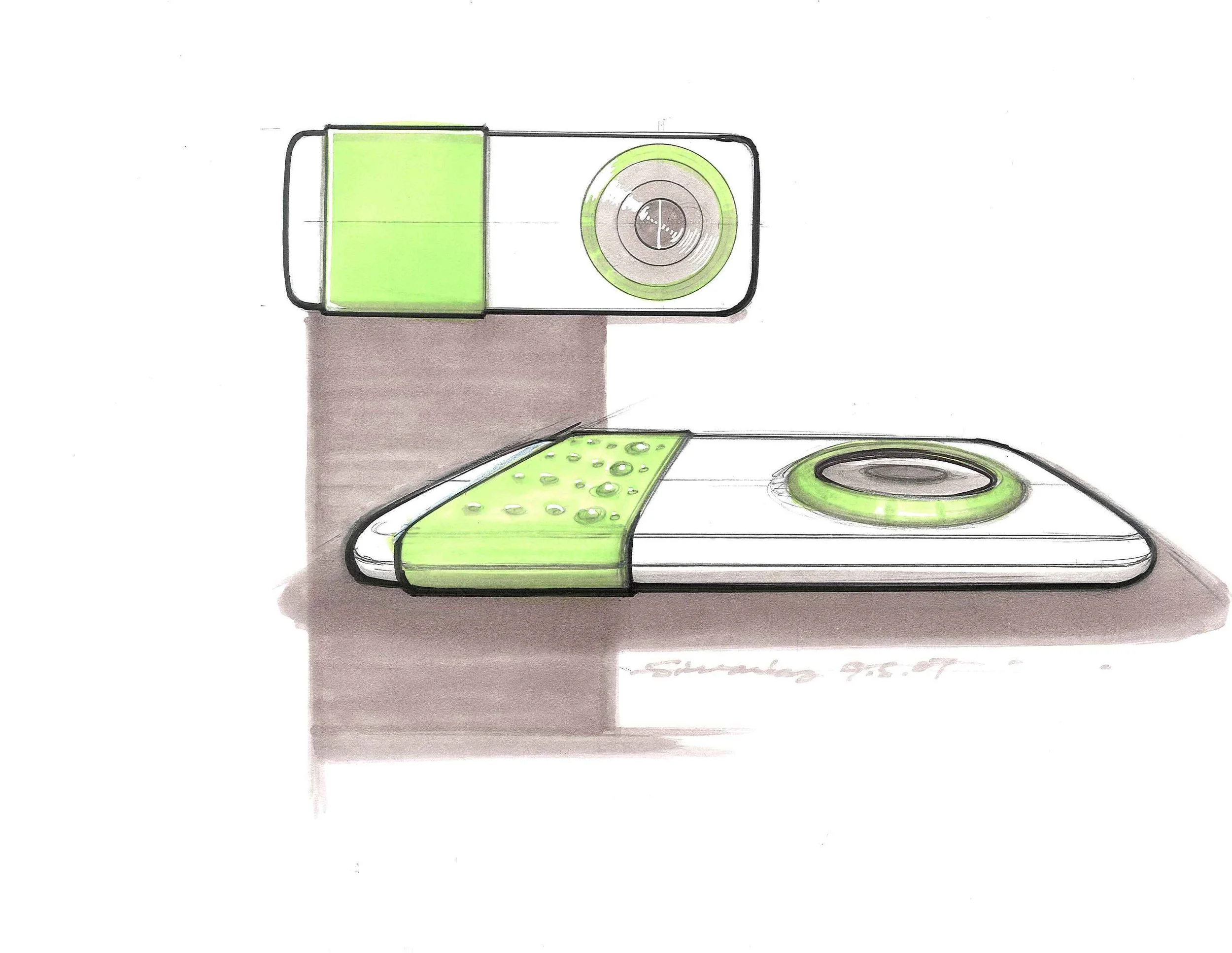
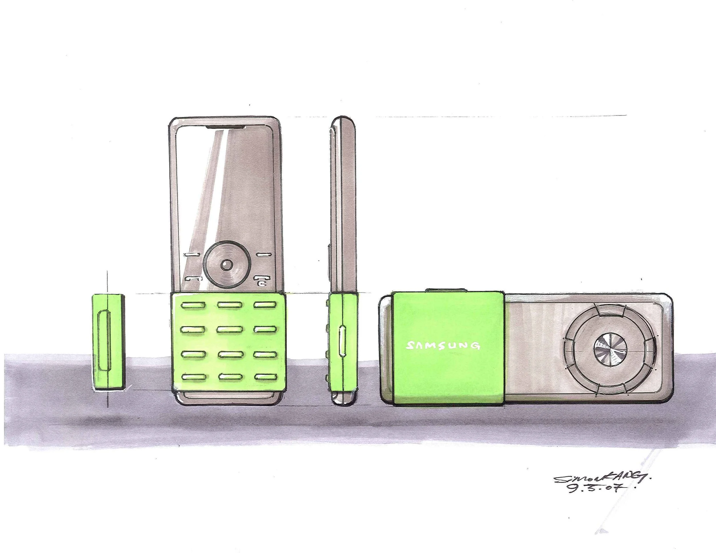
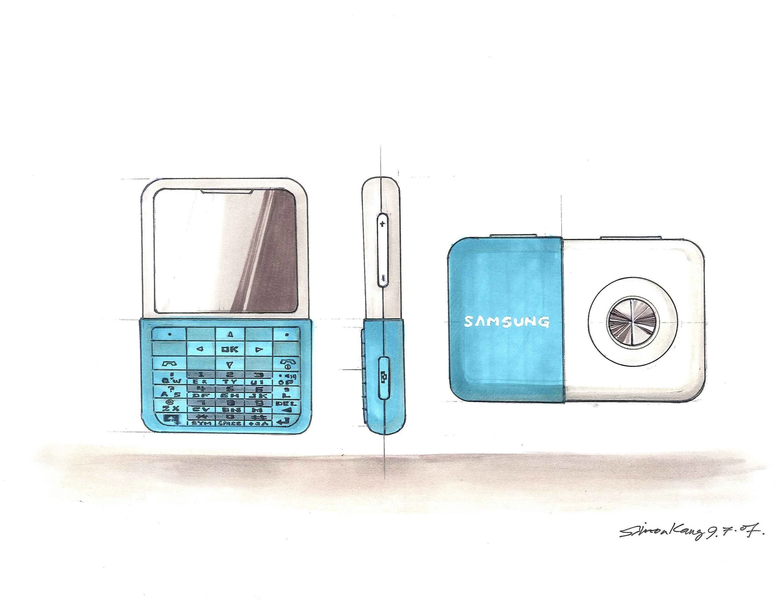
MIRÓ


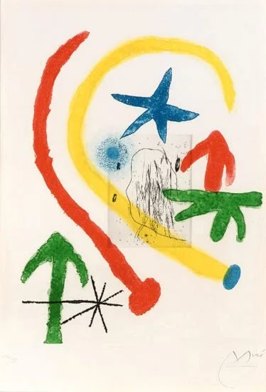
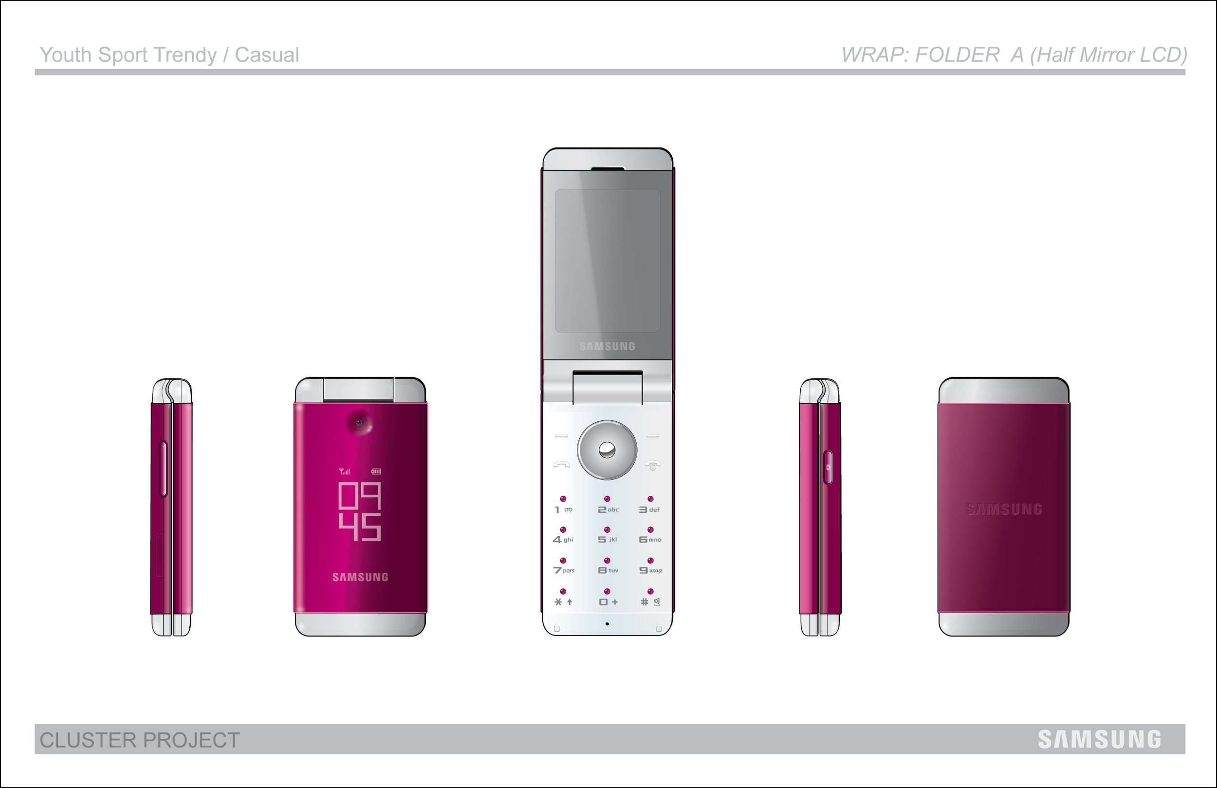
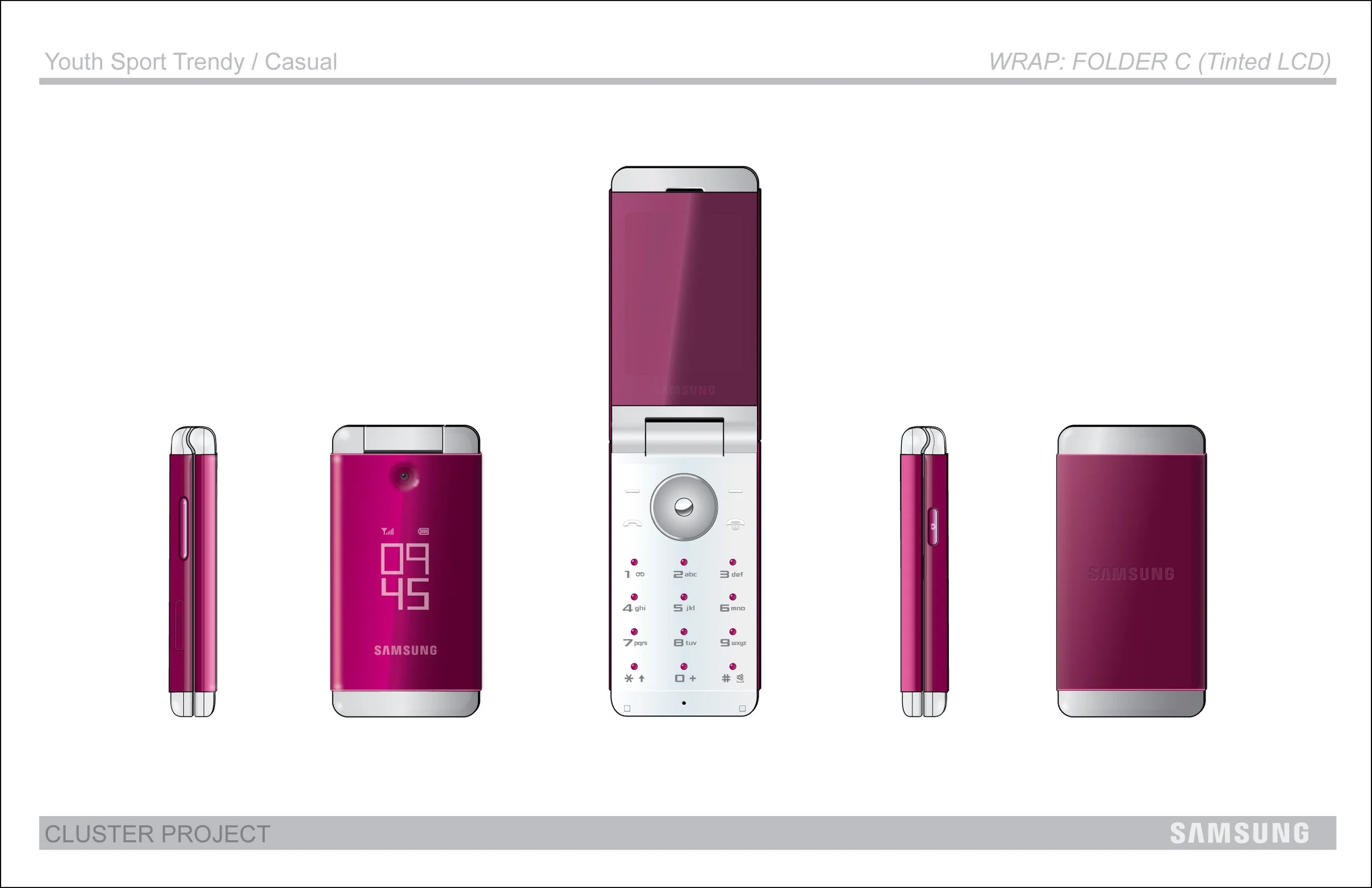
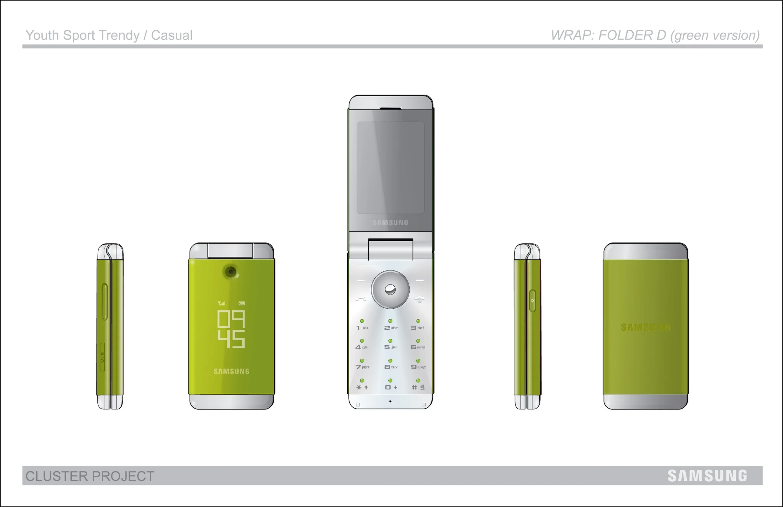
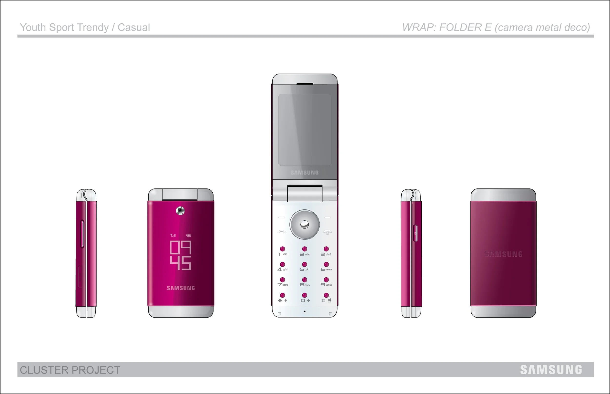
STORY BEHIND THE DESIGN (MIRÓ)
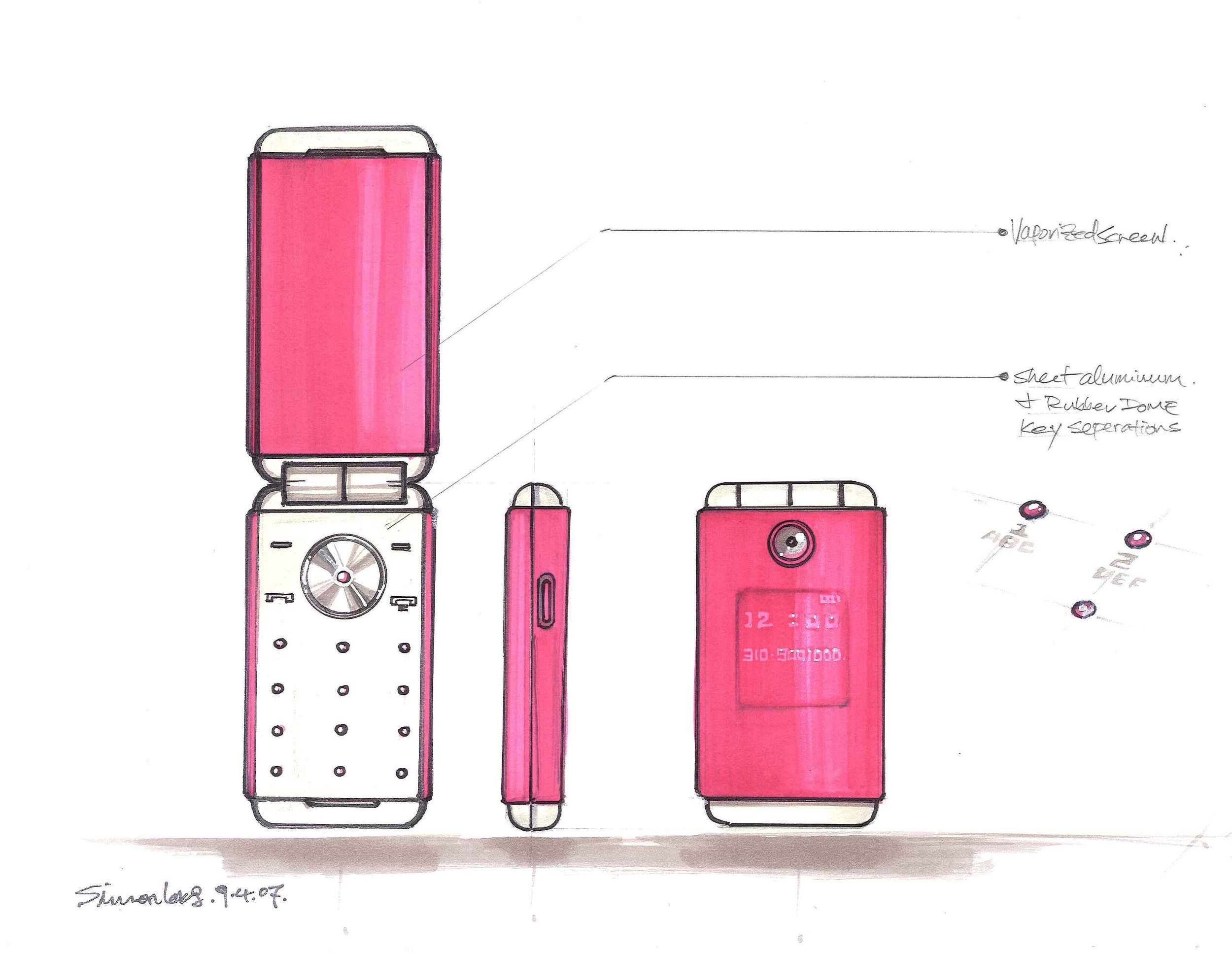
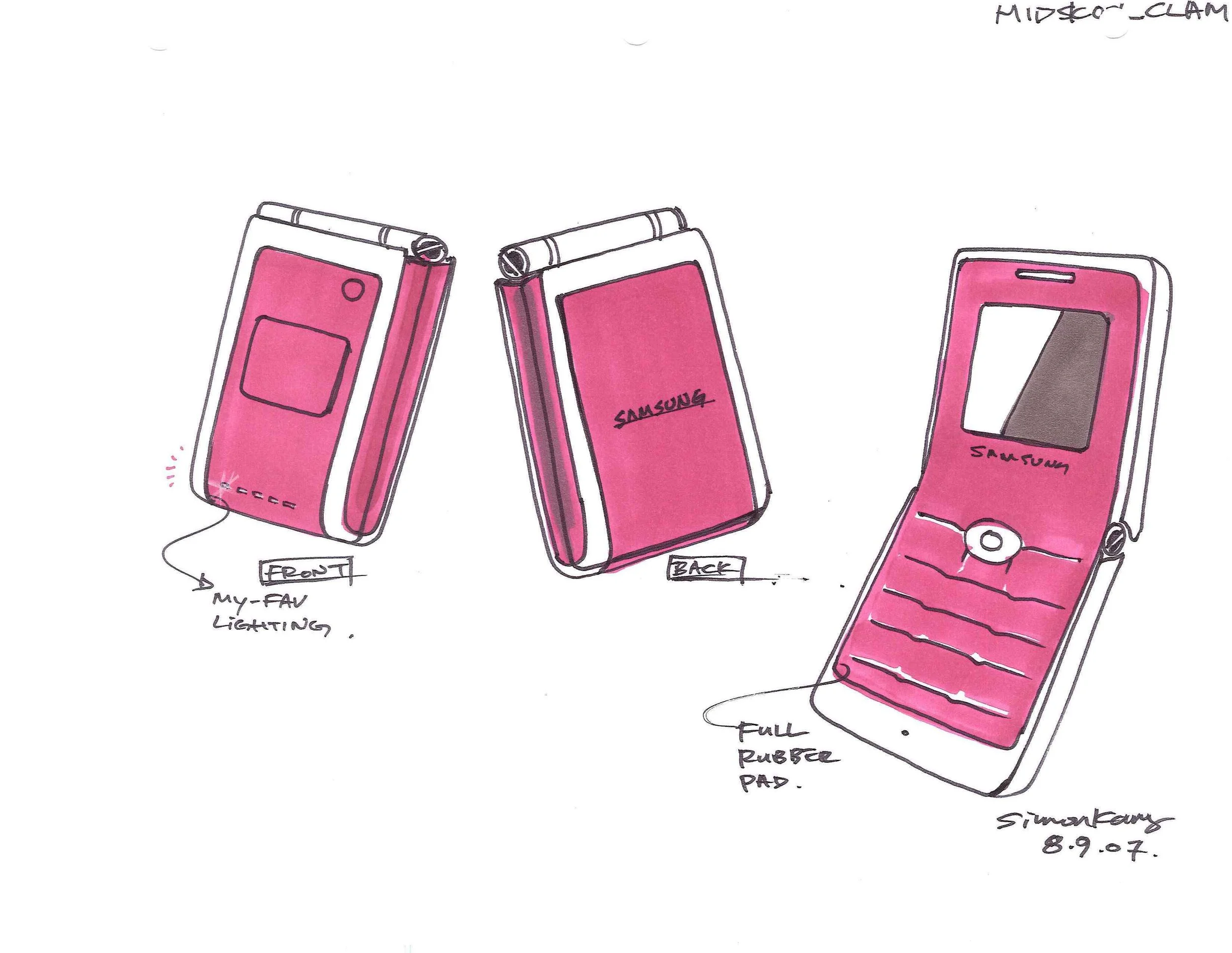
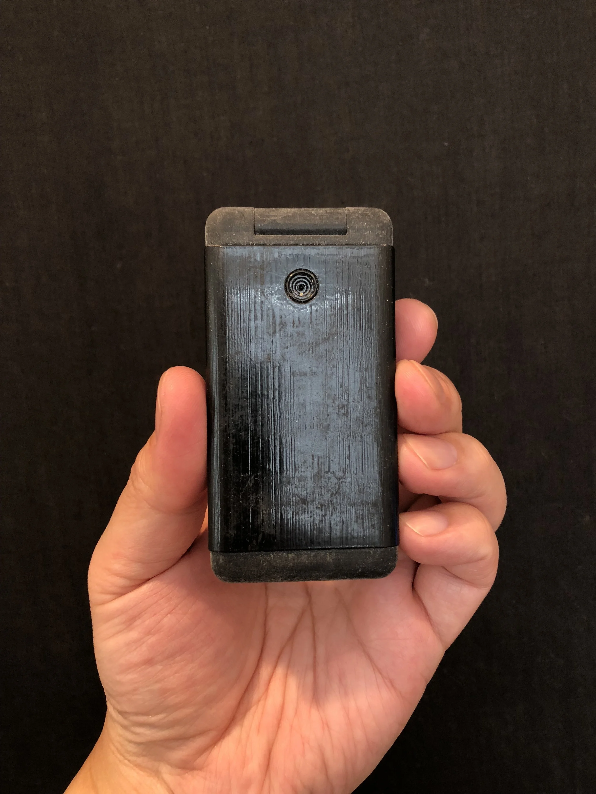
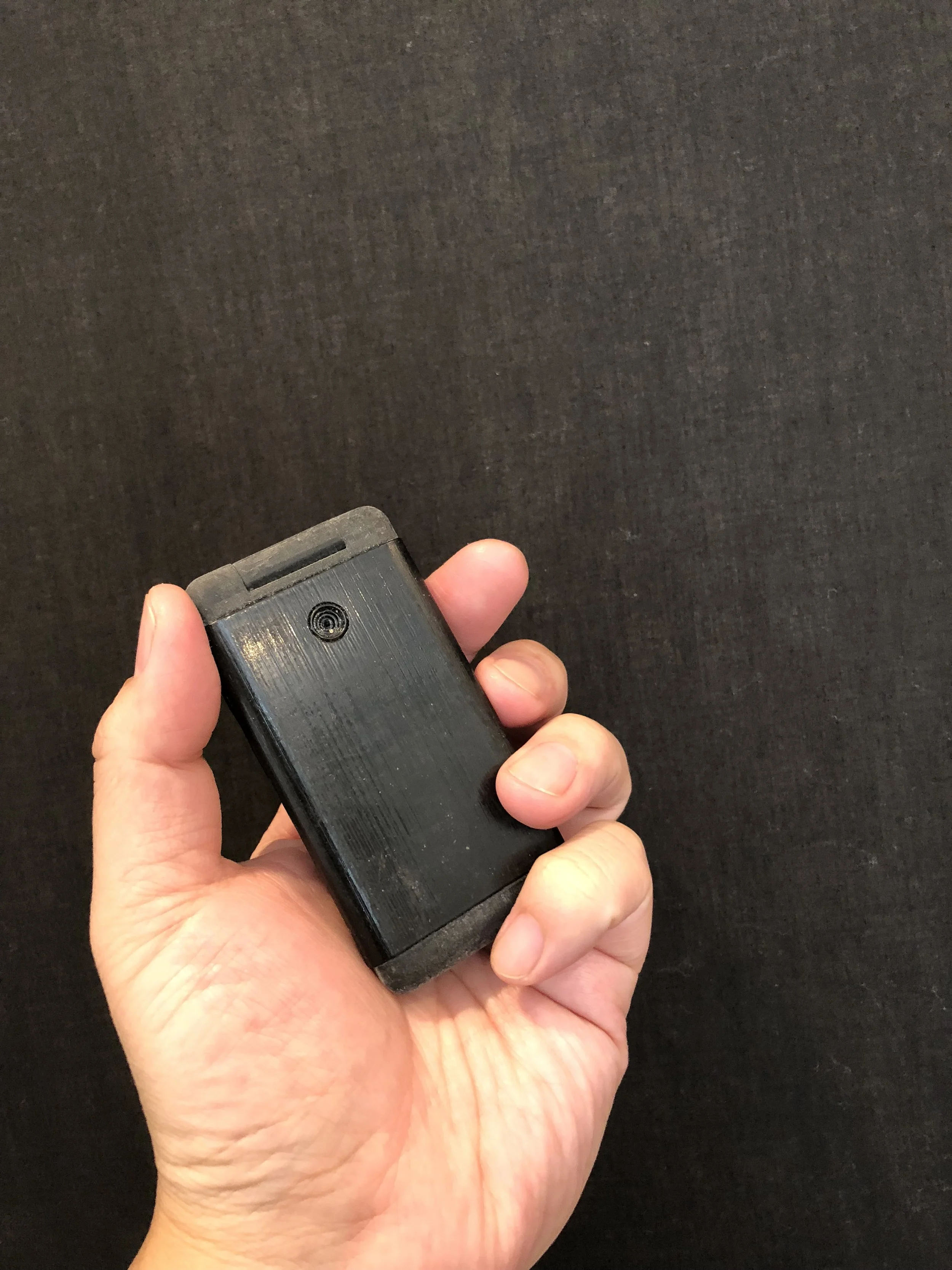
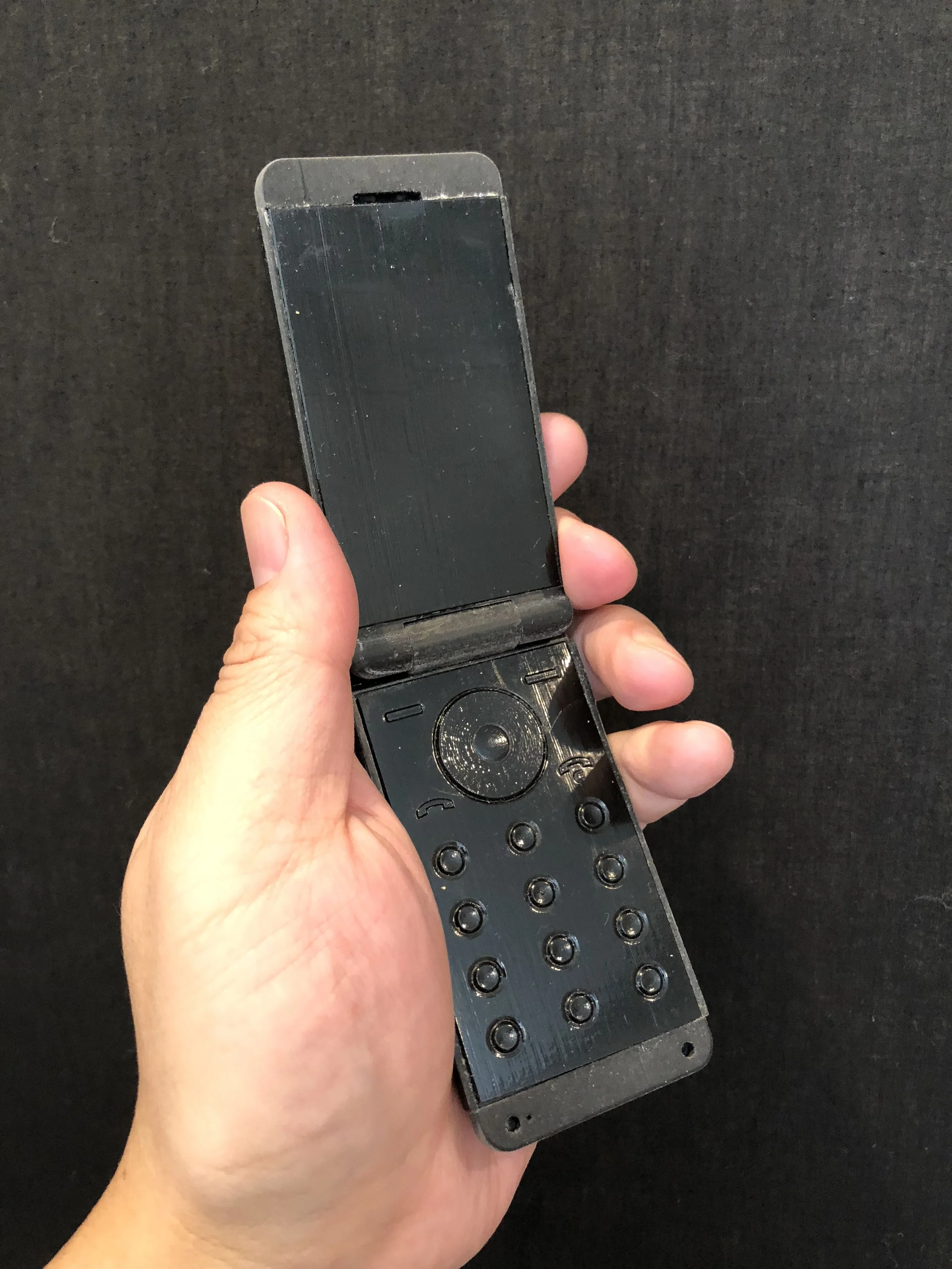
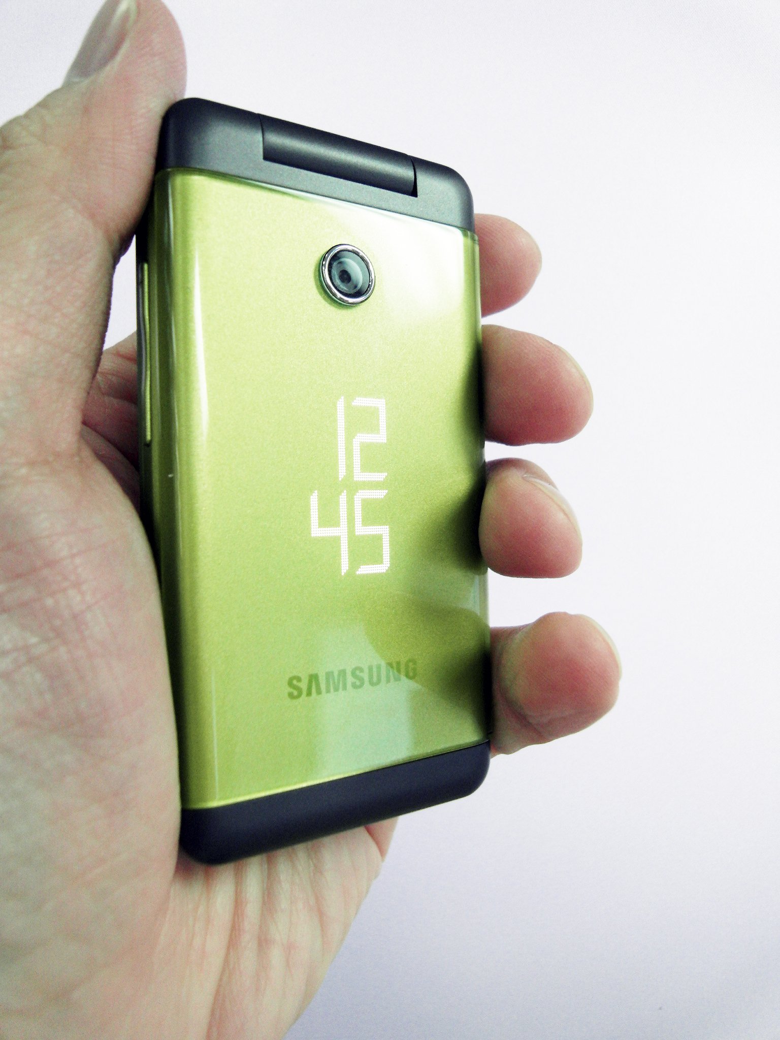
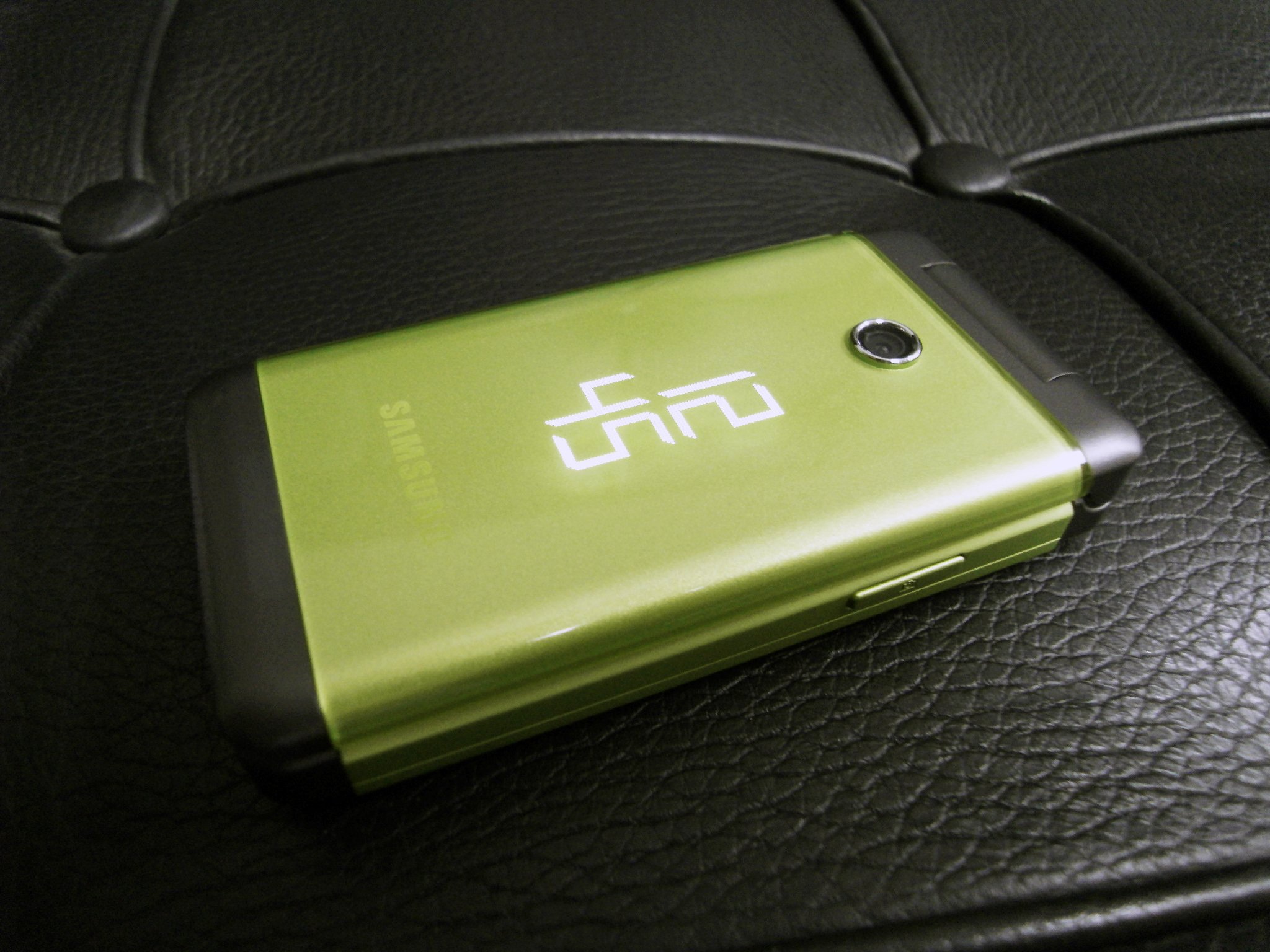
The foldable phone design was inspired by whimsical color and the playful abstraction of JOAN MIRÓ, bringing artistic expression into everyday technology.
LED lighting that indicates time emerges from the electroplated faceplate, creating a sense of magic in the interaction. The Samsung logo was intentionally subdued, treated as a subtle design element rather than a dominant mark. Taking a graphic design approach, I carefully considered font, text proportions, and button sizes to achieve visual balance. The call and end buttons were reduced to simple, intuitive icons instead of relying on conventional text or awkward shapes.
The choice of materials such as metal, silicone, polycarbonate, paint coating and half mirror ion-plating was deliberate, each contributing to a CMF story that conveys refinement, tactility, and expressive detail.
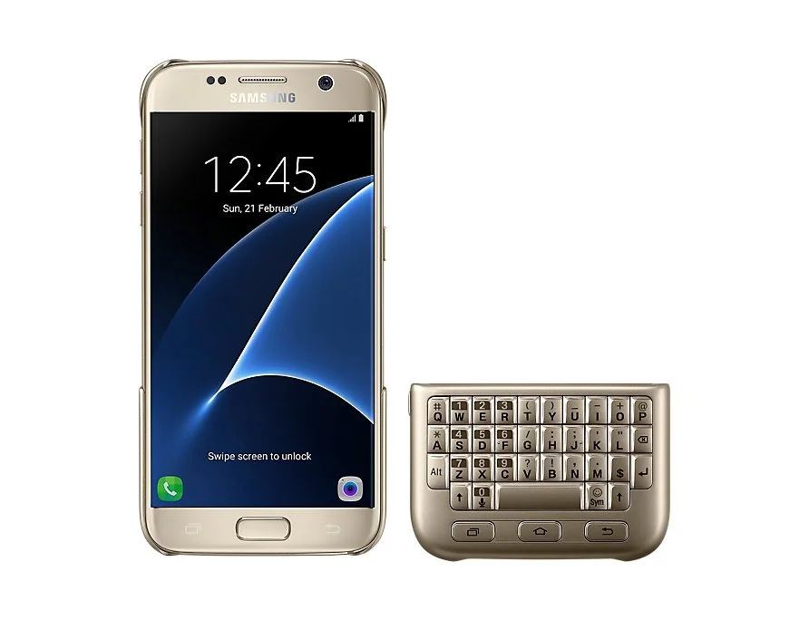
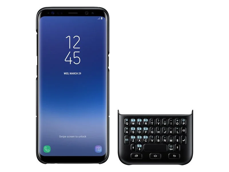
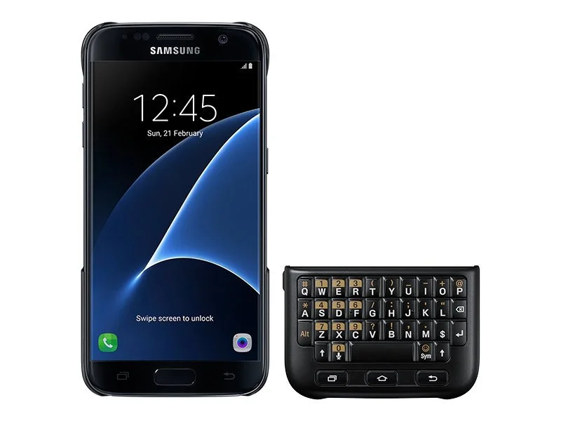
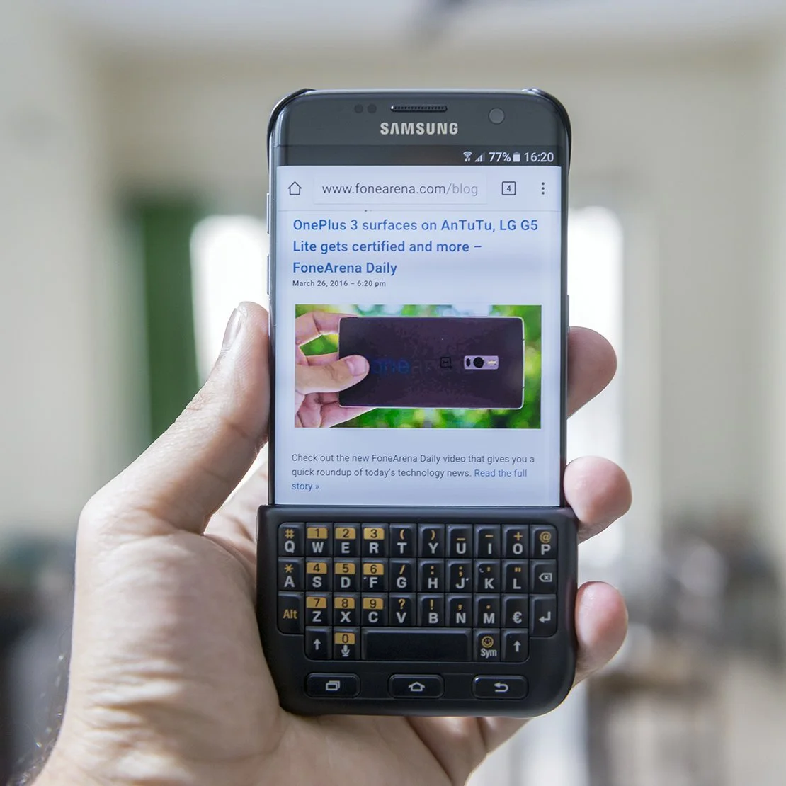
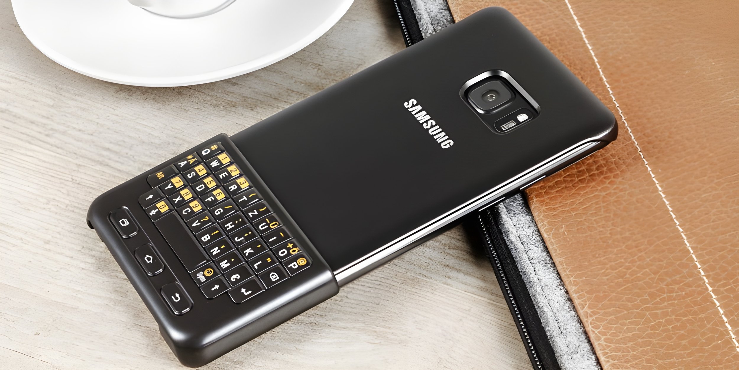
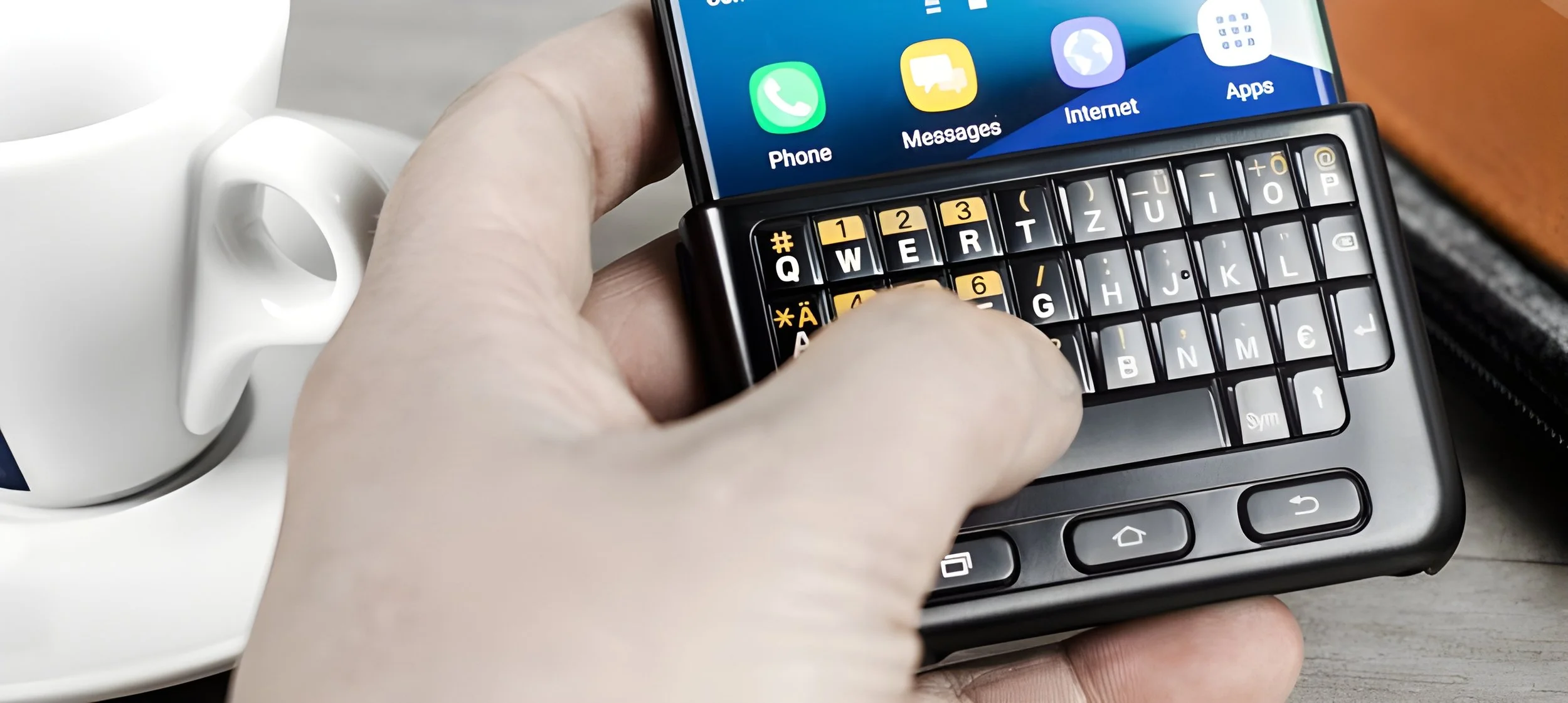
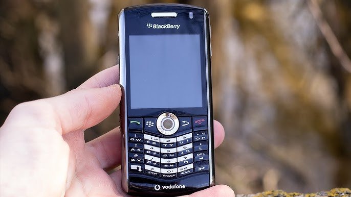
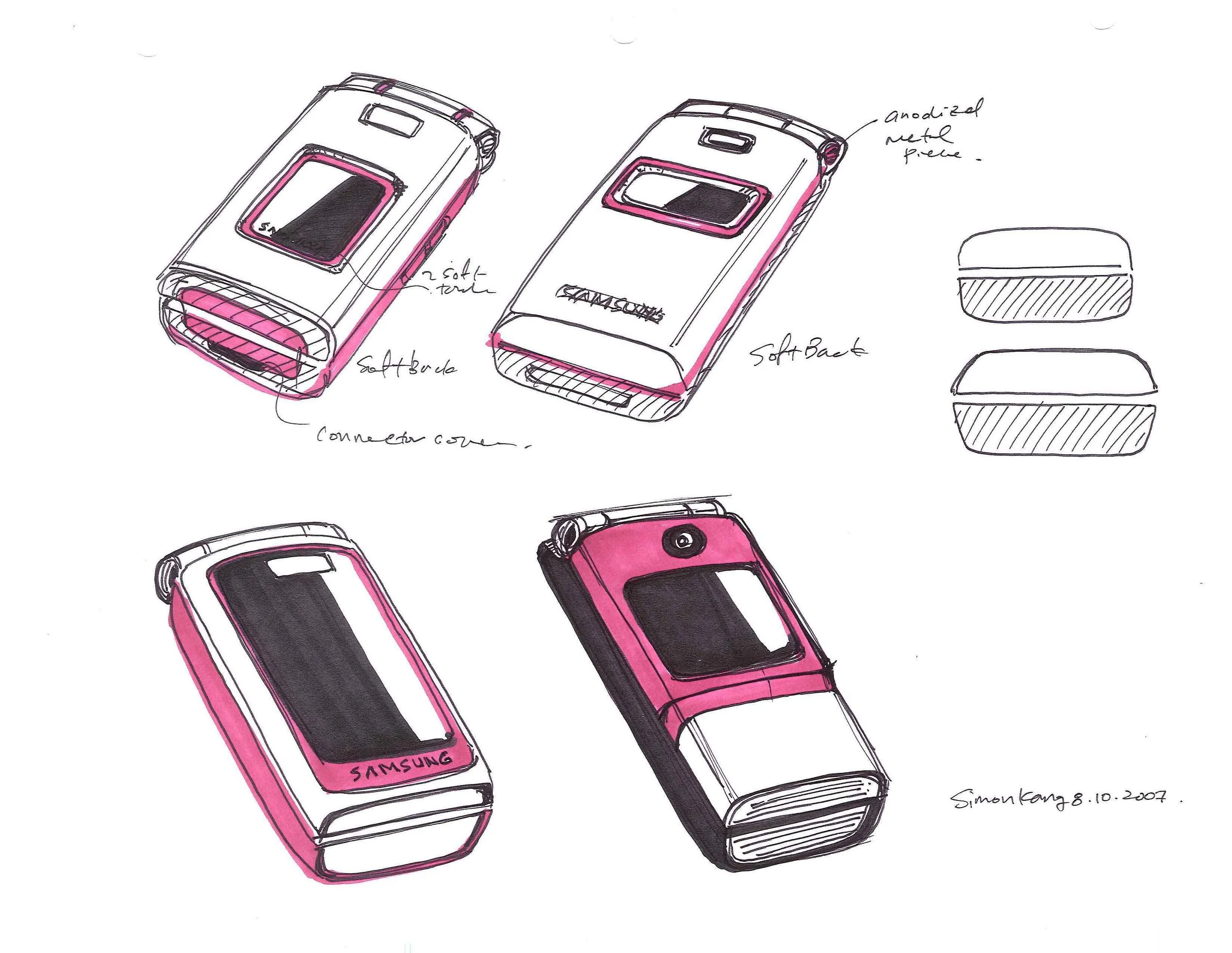
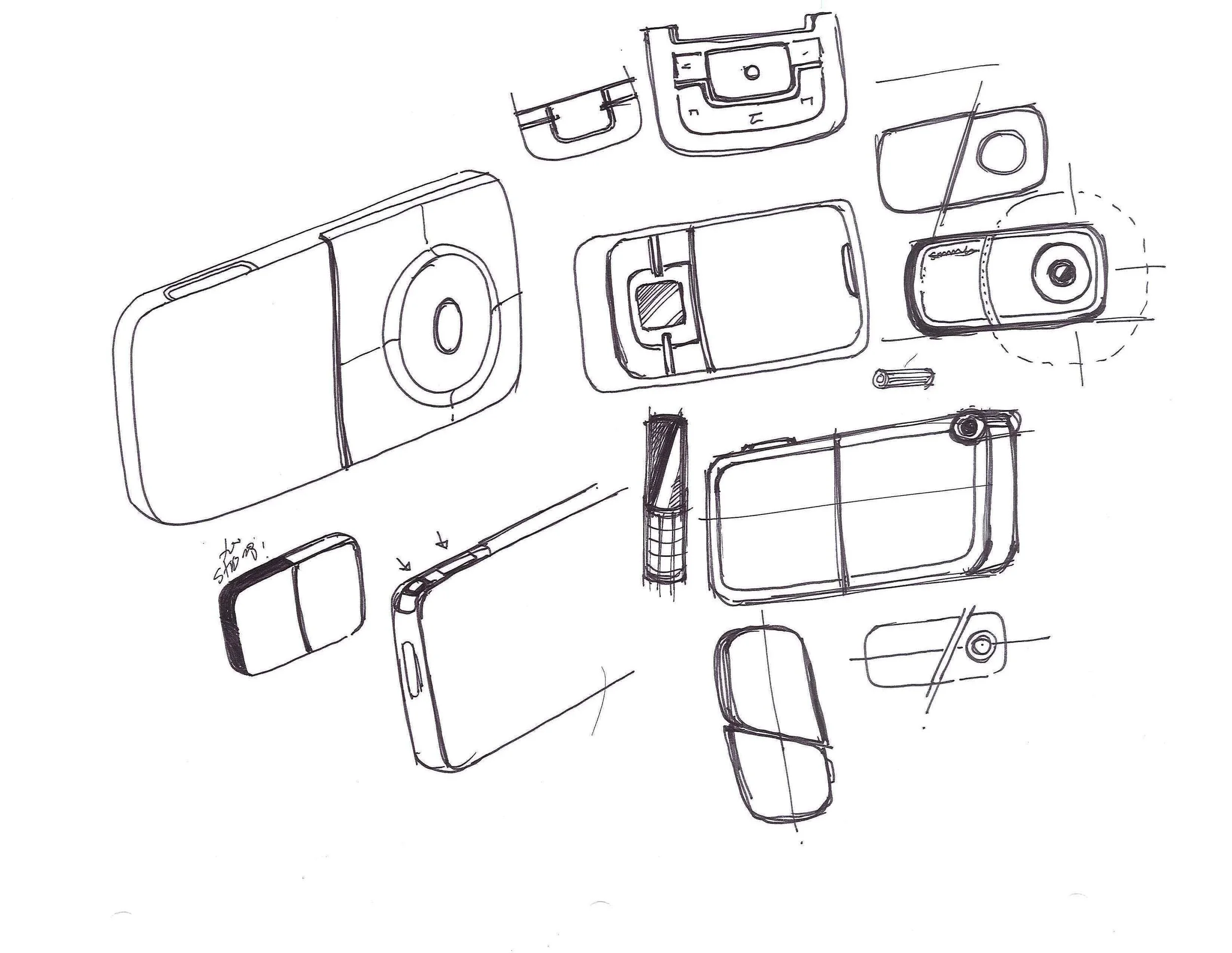
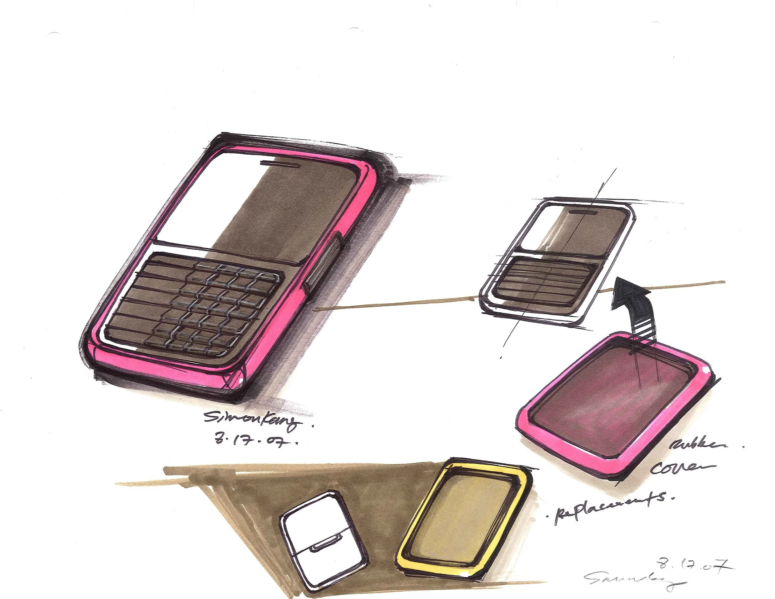
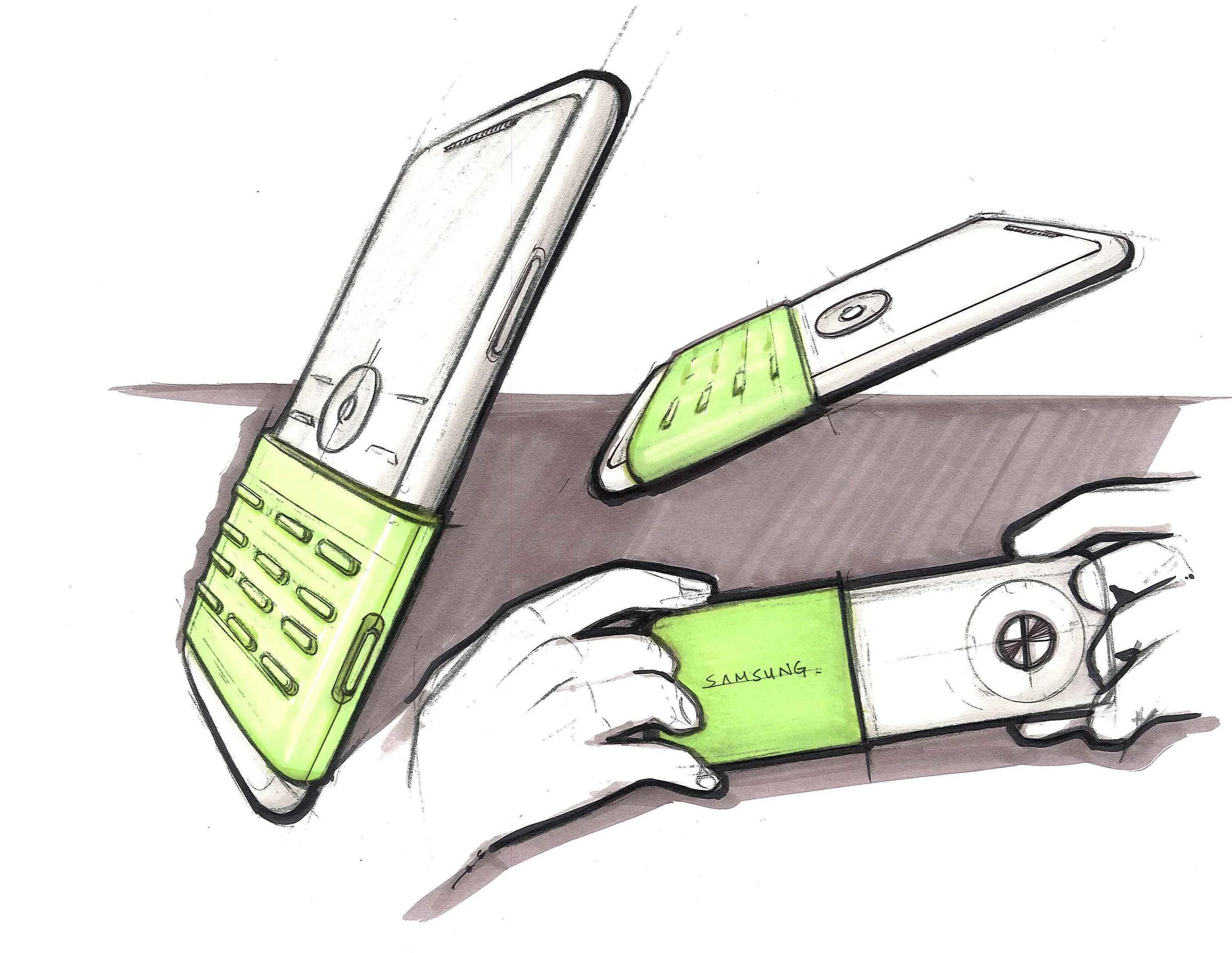
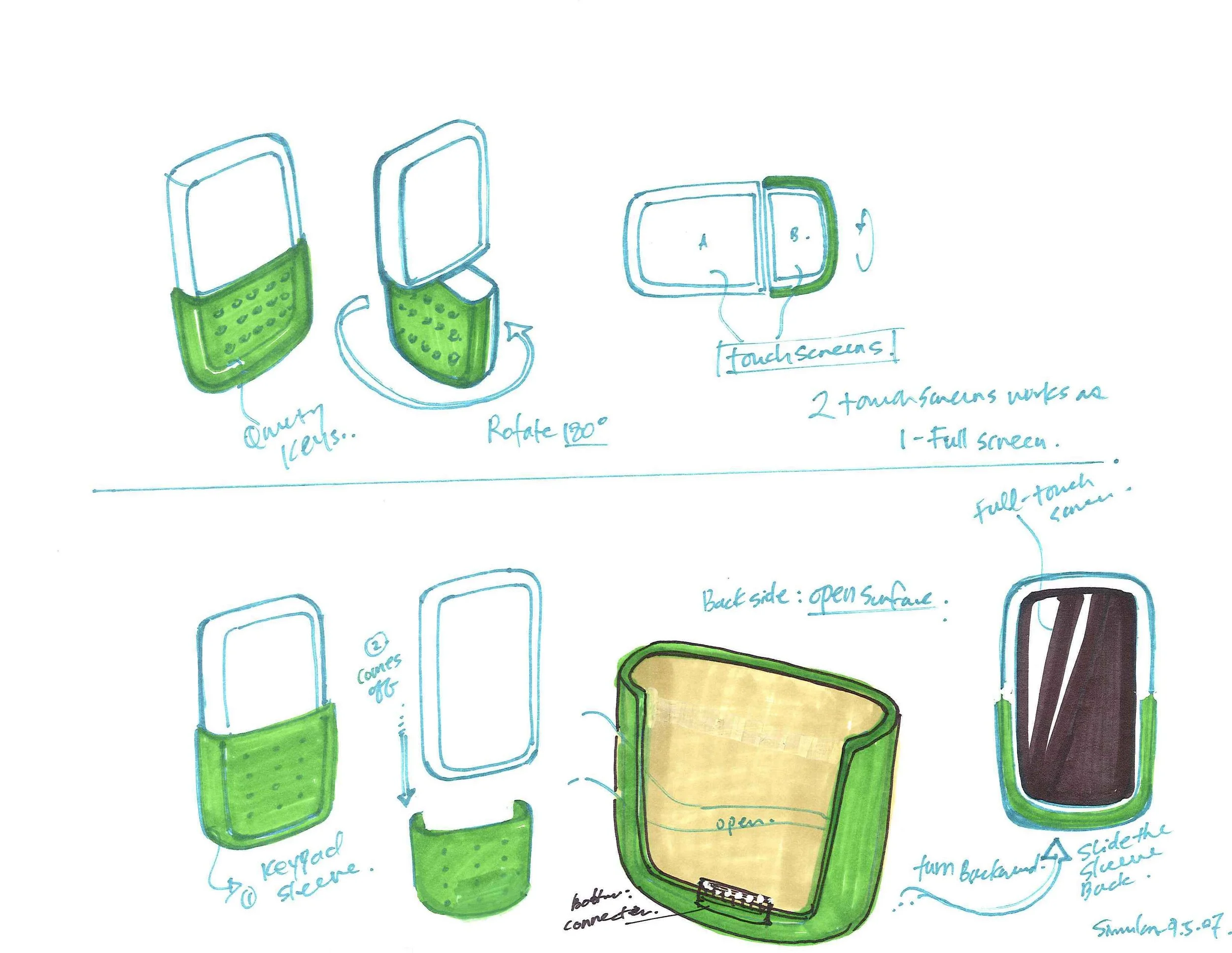
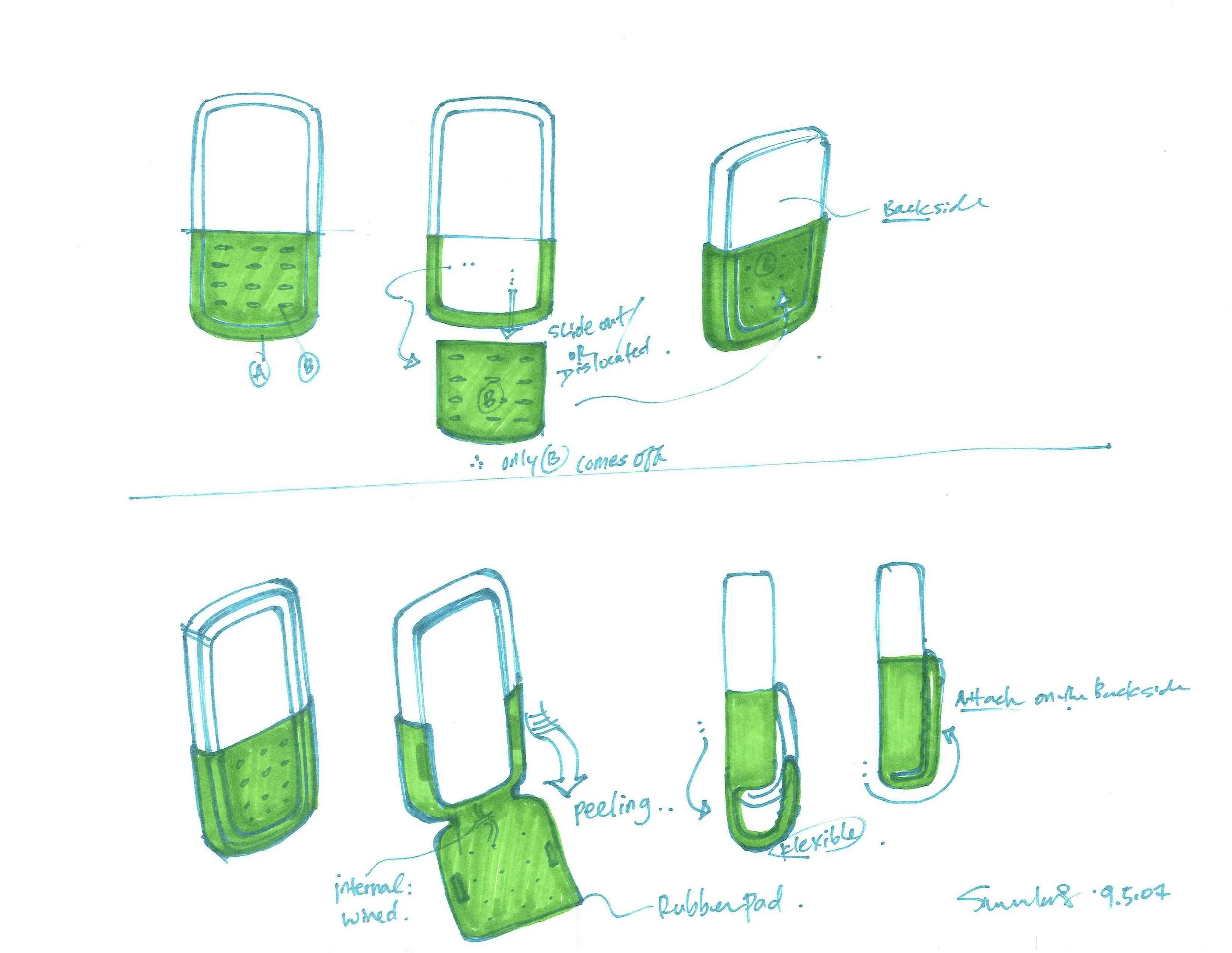
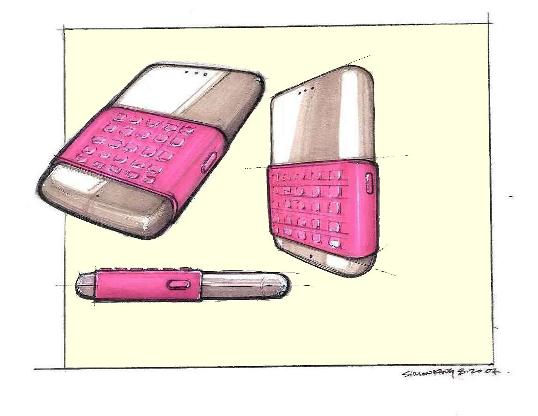
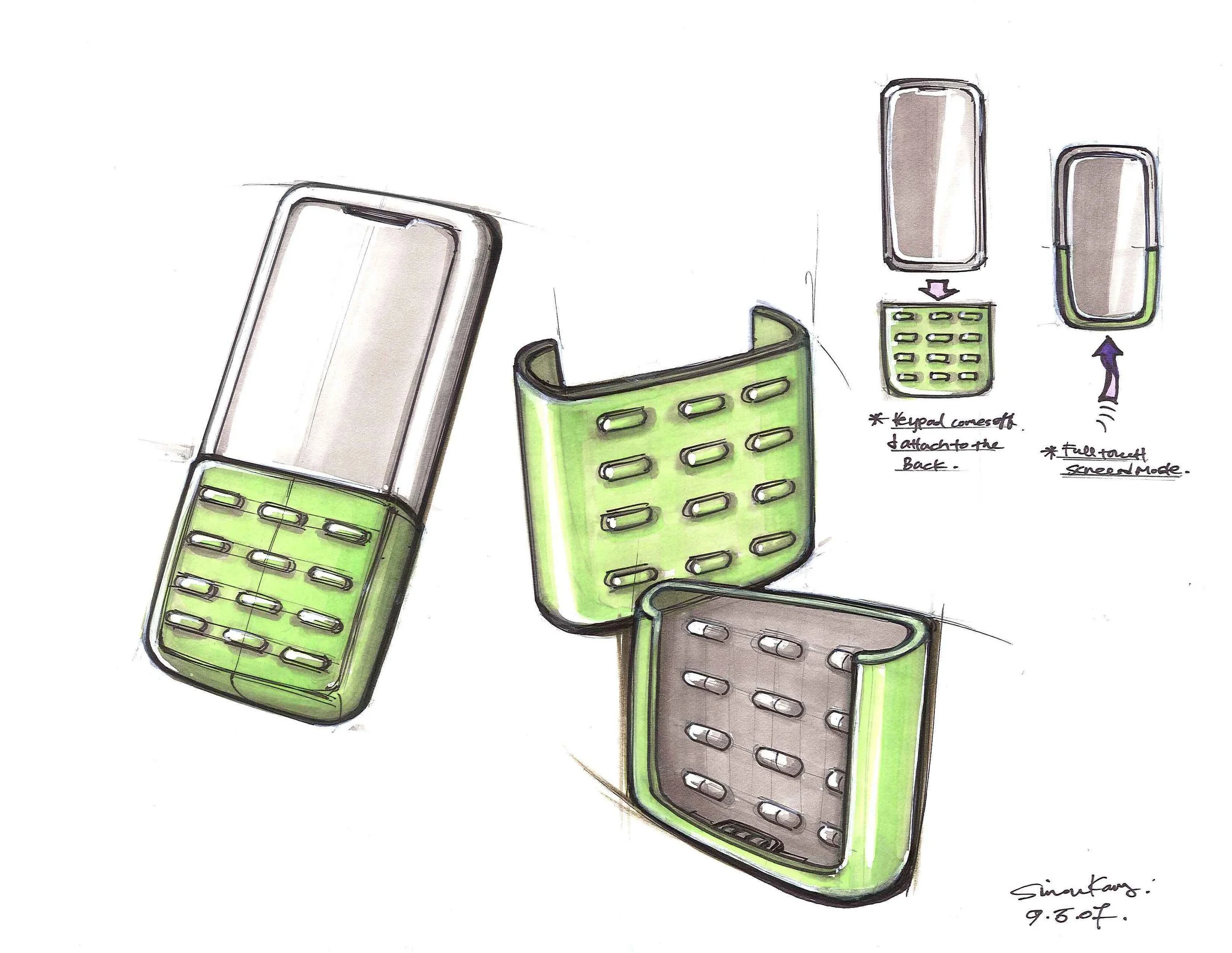
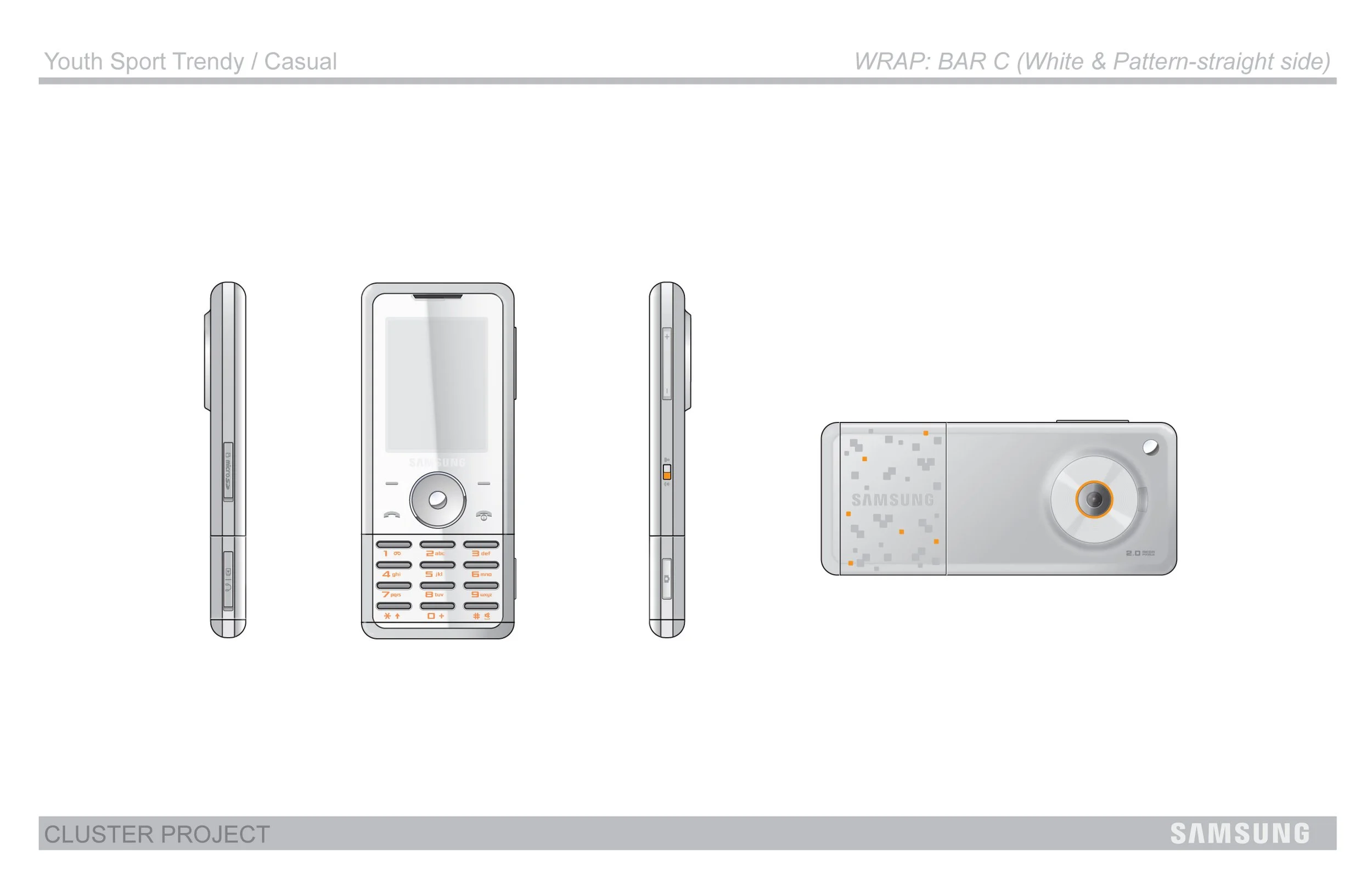
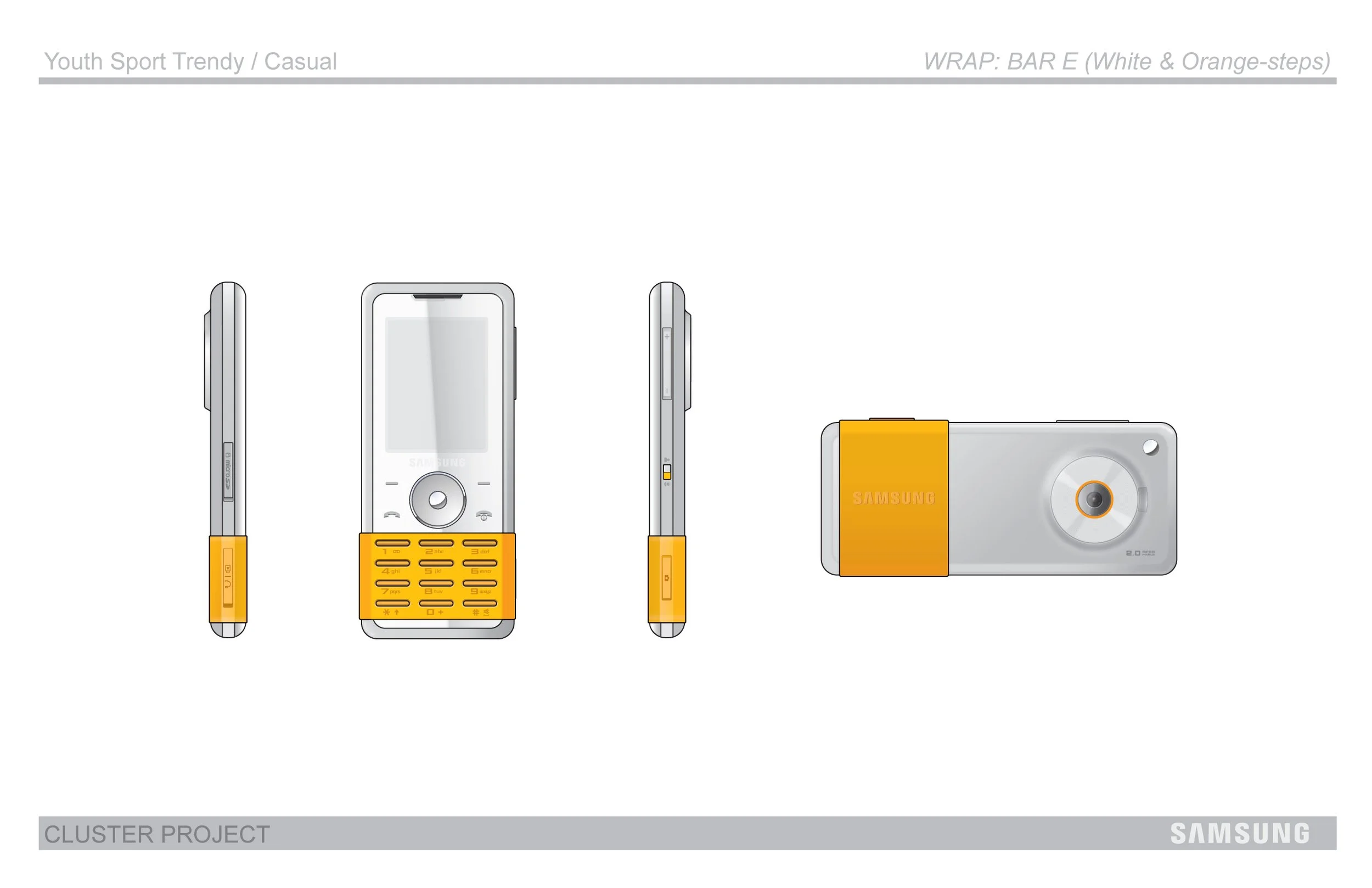
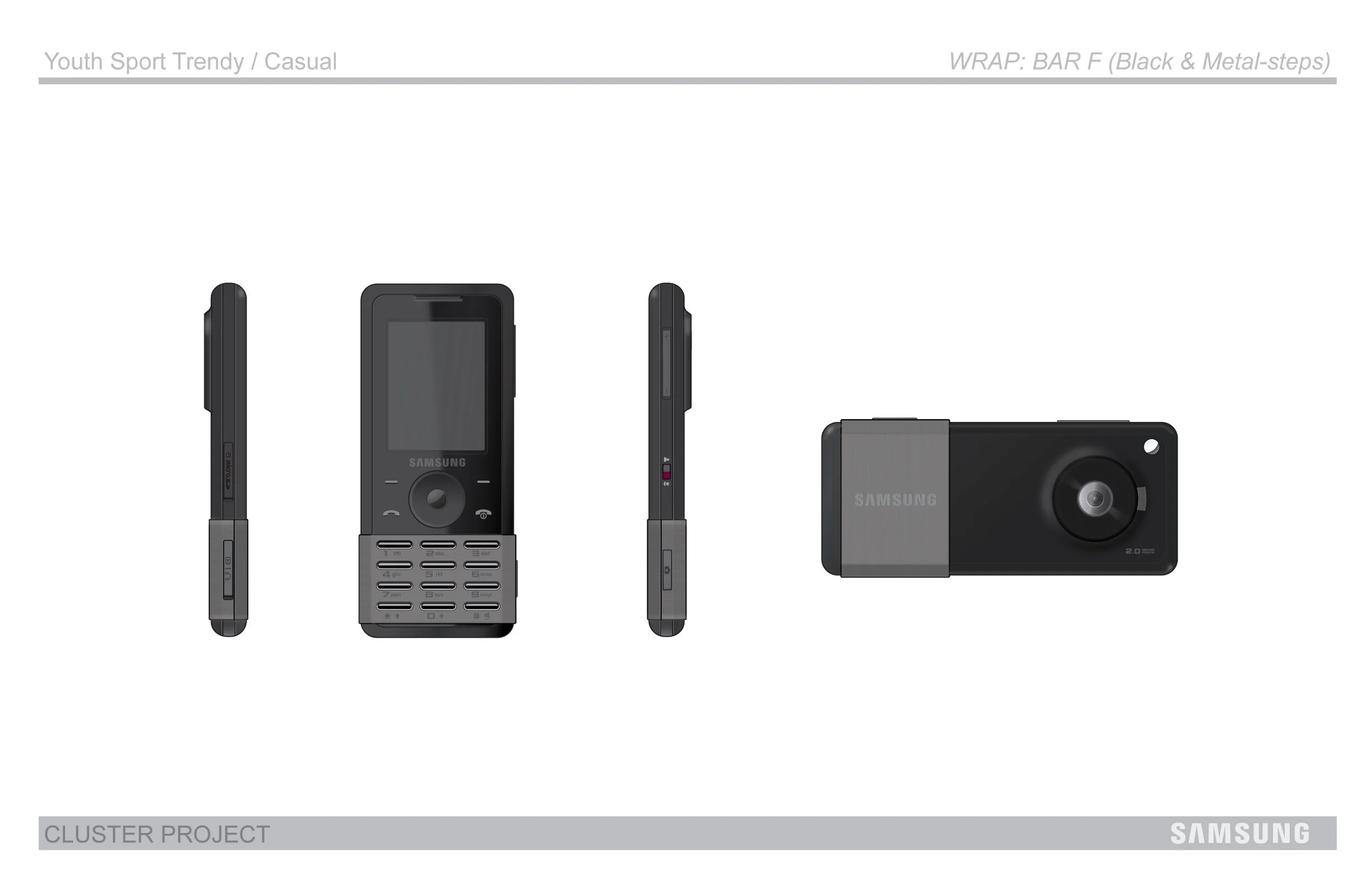
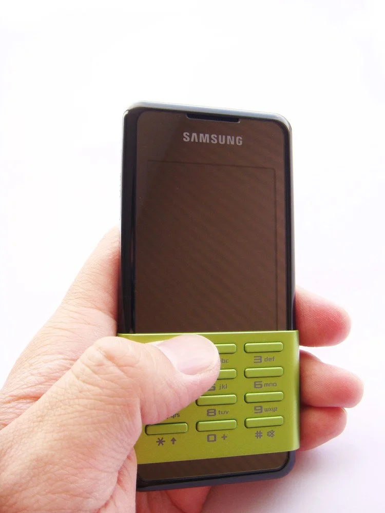
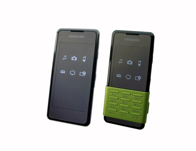
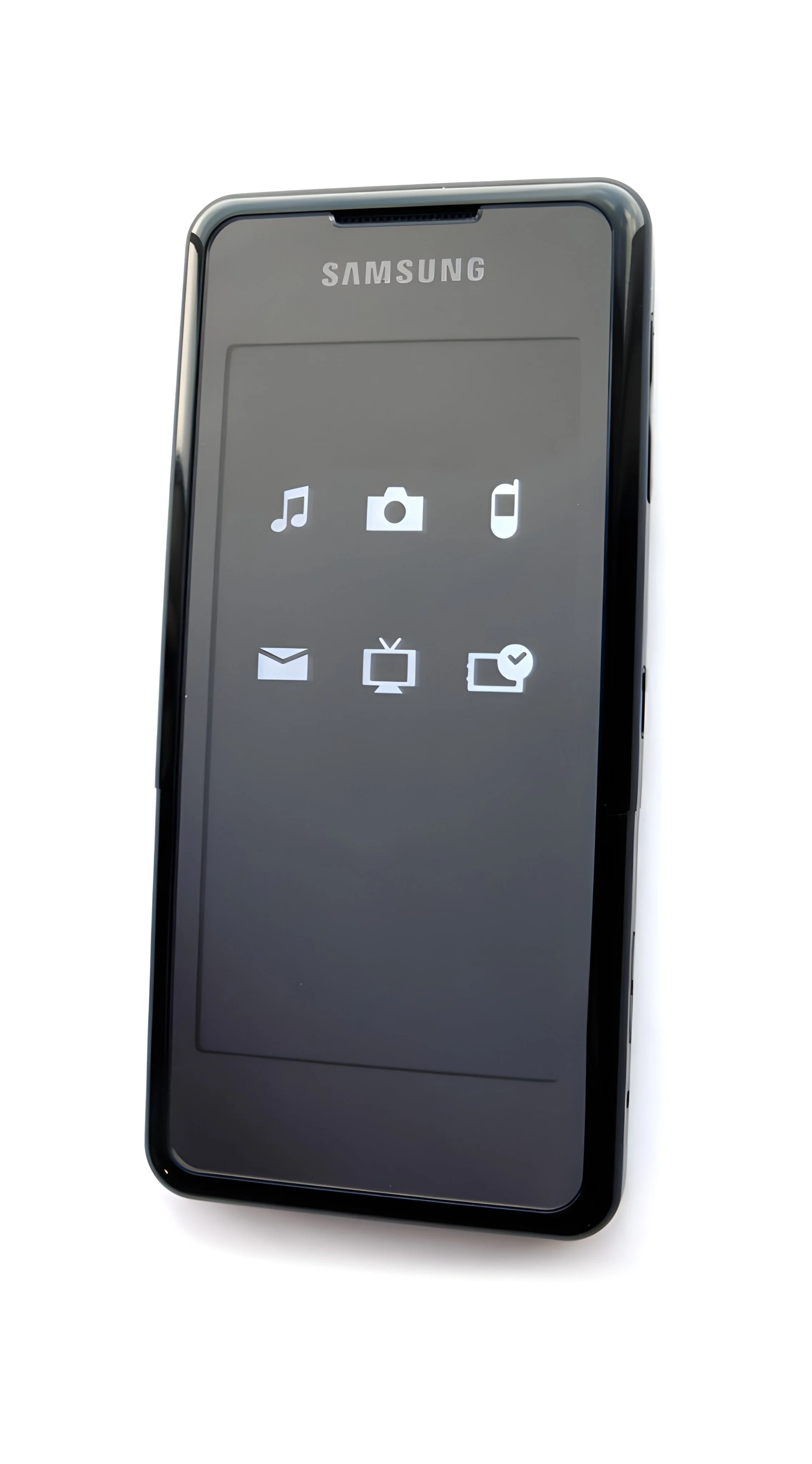
PROJECT 2: IDEATION FOR THE TOUCH SCREEN PHONE
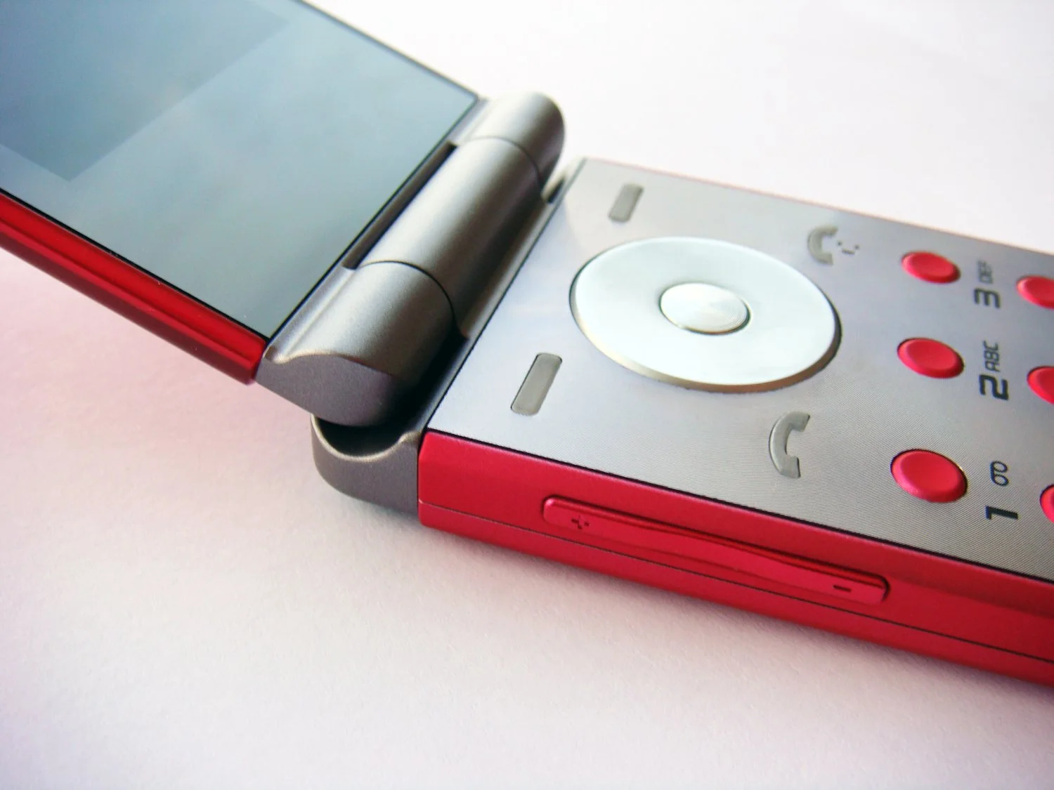
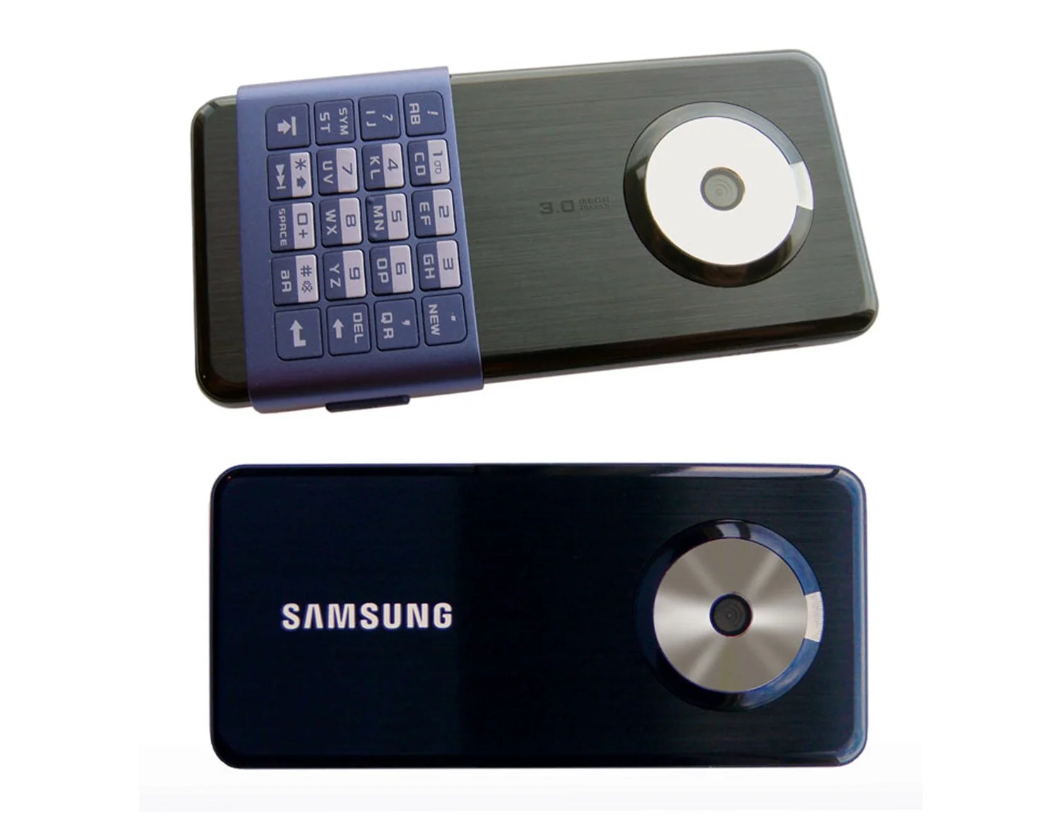
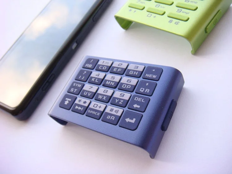
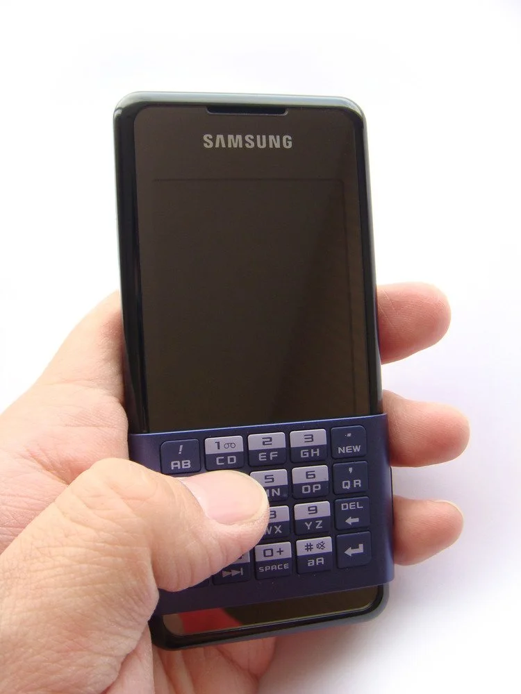
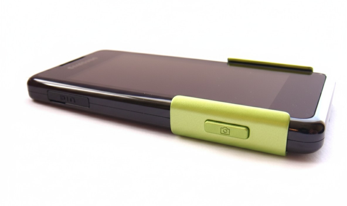
This concept explored how Samsung could enter the emerging era of touchscreens. At the time, texting was central and BlackBerry devices still defined mobile interaction. I envisioned a removable cover with physical buttons that could clip on for typing and slide to the back when not in use, allowing users to shift easily between tactile input and full-screen experiences while highlighting the growing role of the camera.


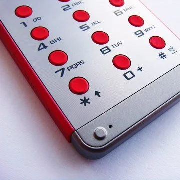
PICASSO


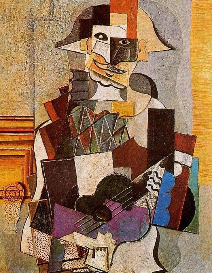
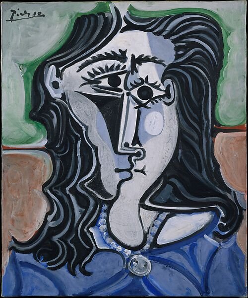


STORY BEHIND THE DESIGN (PICASSO)
Removable covers offered tactile keys in different styles, from QWERTY layouts to numeric keypads, allowing users to swap based on preference. The idea was inspired by PICASSO’s Cubism, where faces are portrayed from multiple angles and merged into one composition. In the same way, the phone could deconstruct and reconstruct its interface, offering different perspectives of interaction within a single device.

FROM CONCEP TO REALITY
This concept anticipated a feature later realized by Samsung, which introduced its first smartphone keyboard covers in 2015, eight years after the touchscreen era began in 2007.